Spring Color Palettes: 10 Refereshing Color Combinations
In anticipation of the coming season, we put together 10 Spring color palettes that you can try for your next design projects. As students of design, we were taught that there are colors that should not go together. Pink and red, orange and purple, navy and pink, and a lot more odd combinations. And yet… they can. As you will discover in the photos below, you will realize that it is not so much about the colors themselves, but more on the choice of shades and how you mix them that make the difference. Yes, even orange and pink, if done right, can work harmoniously together.
So take some time out of your day to look at some color explosion eye candy. I am sure these Spring color palettes and combinations will result in beautiful artistic creations for your graphic design projects, web design, or even for your home and fashionable outfits this coming Spring. In fact, you can also use these Spring color palettes in planning a wedding, debut, engagement party, and other events. Have fun with them! Photos are from Pinterest.
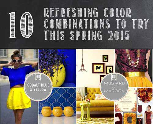
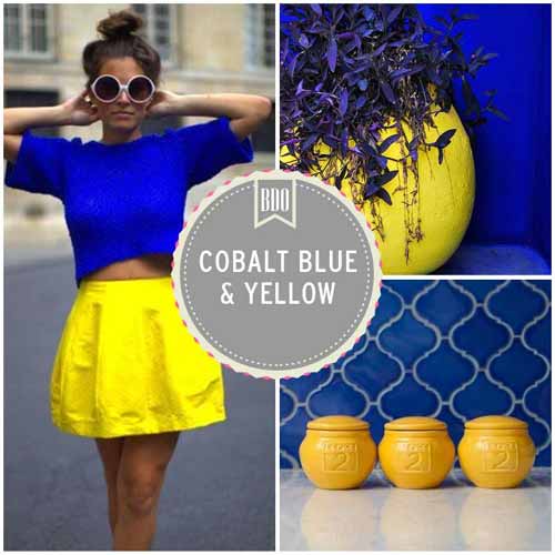
01: COBALT BLUE AND BRIGHT YELLOW COMBINATION
Yellow and Cobalt blue, which is a deep blue pigment, look great together. Both are bright and can be mixed in various shades as well as look good with other bright accent colors. Use this combination if you want to stand out from the rest. Use it for advertisements, for billboards, signage, etc.
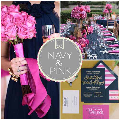
02: NAVY BLUE AND PINK SPRING COLOR PALETTES
Combining pastel with neutral makes a happy combination that’s easy on the eyes. Navy, which is dark blue–almost black, when paired with pink makes the latter color stand out. Use the navy and pink for fashion, wedding, etc. It would also look good as a color scheme for your bedroom.
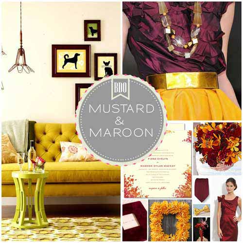
03: MUSTARD AND BURGUNDY COMBO
There is something luxurious about burgundy and mustard when mixed together. Okay, it’s Autumn-ish but who cares?
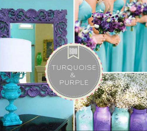
04: TURQUOISE AND PURPLE SPRING COLOR PALETTES
Turquoise and Purple is a luscious combination. Use this combination if you love strong, vibrant colors. However, when using this combo, make sure to incorporate a pleasing neutral color, such as white or soft beige along with a little sparkle or shine, otherwise you’ll have too much chaos and not enough harmony.
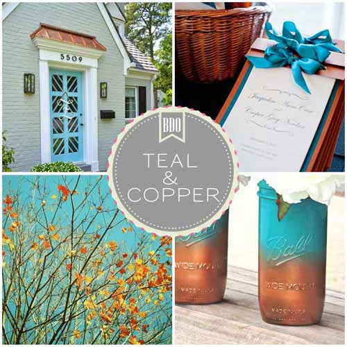
05: TEAL AND COPPER
Teal and copper are a very elegant color combination. Both colors exude a regal richness that’s simply perfect for setting the tone for a gorgeous wedding or an elegant bedroom or a sophisticated to get up for a special occasion.
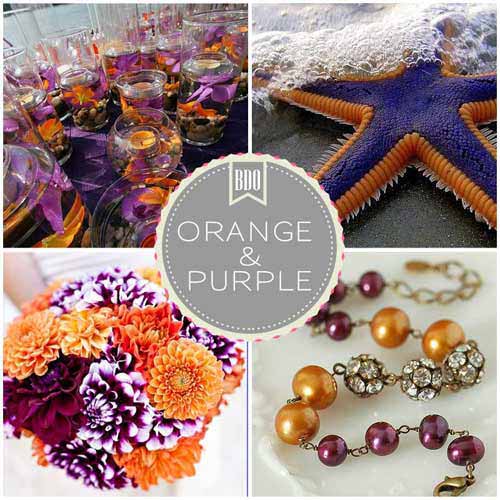
06: PURPLE AND ORANGE
Combining two bright colors such as purple and orange can be dramatically bold and seriously chic as shown in the pictures below.
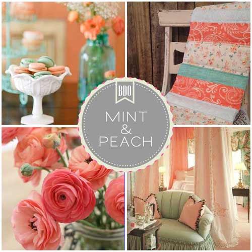
07: PEACH AND MINT
Mint and Peach is such a wonderful color combination. It is fun, sweet, chic, romantic, whimsical, classy and pretty among other things. Peach and mint pair up in a way that comes as very effortless and romantic.
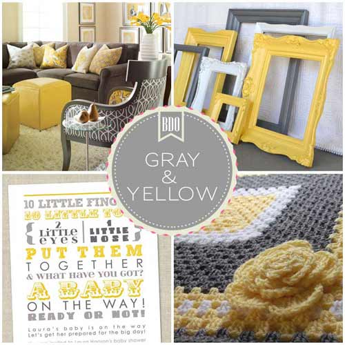
08: YELLOW AND GRAY
A versatile combination, gray and yellow color scheme can work in many different directions for a look, feel, mood and style. It’s a classy, chic combo that brings together a calm neutral with a warm hue.
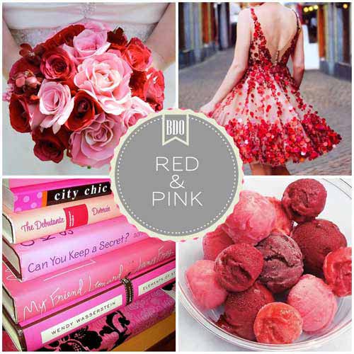
09: RED AND PINK
It doesn’t have to be Valentine’s Day or February to incorporate pink and red in your outfits and interiors. Since pink and red are both romantic colors, this combination is perfect for weddings and engagement parties.
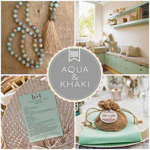
10: AQUA AND KHAKI
Here is another combination featuring two muted pastel colors. When combined they produce a very calming effect. Try to incorporate this combination in your home decorating ideas or in your outfits. This also looks good as a motif for weddings and other events.
For more color inspiration, check out also our roundup of 25 Spring color palette combinations.