Spring Color Palettes: Floral Inspiration
What’s spring without a big hit of color? As we transition from cold to warmer weather, we should also be ready to embrace colorful and hot hues. Since Spring is the season where the weather, flowers, and sun are reborn, this season, therefore, brings light and color to the natural world. As designers, we always turn to nature for color inspiration. In this post, therefore, we are sharing beautiful Spring color palettes.
You can use these Spring color palettes to come up with colorful designs for web and for printed materials. The hexadecimal equivalent of each color is indicated for easy use. Another way of getting the right shade is to use your eyedropper in Photoshop.
FLOWER-INSPIRED SPRING COLOR PALETTES
All photos used here were downloaded free from Dreamstime Stock Photos. Each image below has its proper attribution.
Yellow Tulip Flower
Yellow is a bright color and when contrasted with green, produces a very attractive and intense combination. Use this palette if you want contrasting colors in your designs.
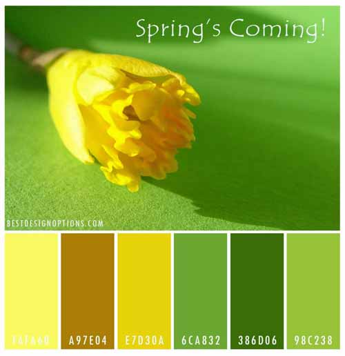
PHOTO CREDITS: © Uschi Hering
Wild Purple Flower
Purple is a wedding flower color for all seasons. Thus, this palette is perfect for a Spring wedding website.
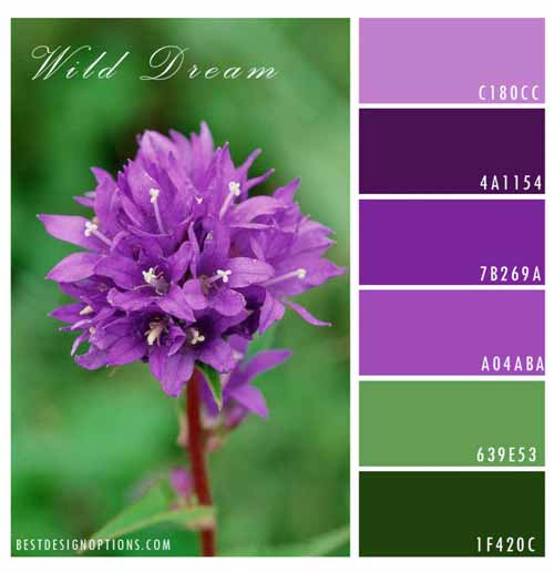
PHOTO CREDIT: © Jinyoung Lee |
Yellow Tulip Macro
When coupled with black, yellow is the highest contrast color as seen in the image below. Bees and wasps use these colors to great effect.
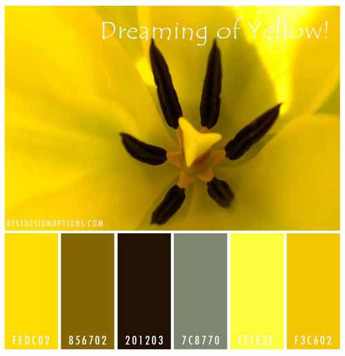
PHOTO CREDIT: © Shawna Bradley
Rose Petals Macro
With hues ranging from halfway between red and magenta, rose petals are a great source of inspiration for creating designs with romantic themes.
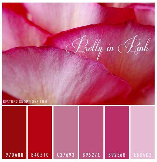
PHOTO CREDIT: © Joao Estevao Andrade De Freitas
Peach Blossoms
Peach is a color that is named for the pale color of the exterior flesh of the peach fruit. The colors that compliment peach would be white, black and the colors that are on the opposite side of the color wheel.
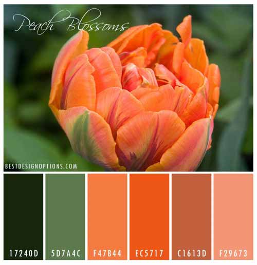
PHOTO CREDIT: © Ostenbaken
White flower
White is not a color. But, it can provide breathing space in your designs. White is associated with simplicity, purity, and goodness. We see white everywhere in branding, businesses, and buildings where we want to feel calm.
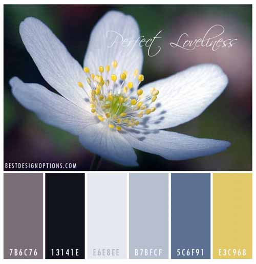
PHOTO CREDIT: © Cristina Bernhardsen
Dandelion’s Fuzz
Well, spring is not all about hot hues. If you need a grayish palette, then this one’s for you. You can create, formal, businesslike and elegant designs using these colors.
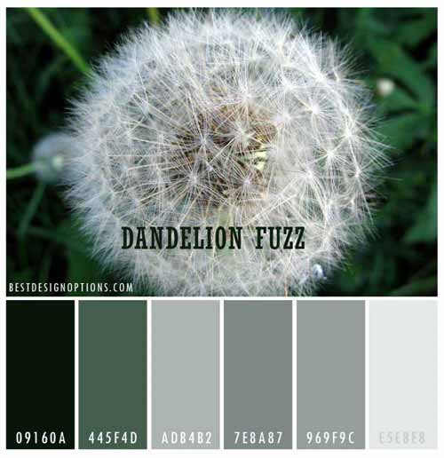
PHOTO CREDIT: © Cratuke
Hibiscus Up Close
Red is the hottest color of Spring. Using this hibiscus filament palette, you can create a big statement in your designs. It is best to use these hues with lots of white spaces in your designs.
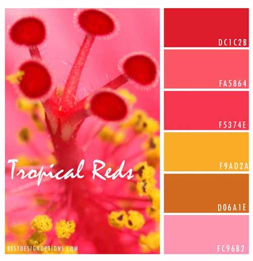
PHOTO CREDIT: © Richard Merwin