25 Best Annual Report Designs from 2011-2012
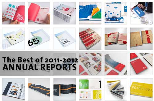
If you are a designer who needs inspiration for designing an annual report, then you have come to the right place. In this post, we are featuring 25 of what we consider are the best annual report designs produced from 2011 to 2012. We decided to pick just the latest designs so we will have a glimpse on the latest trends in annual report designs. Not all of the designs listed below are actual reports of the companies. Some of them are conceptual designs from students.
An annual report, for many firms and companies, is considered a design showpiece simply because it reflect the success of their business or operations. Companies are starting to realize that coming up with nice annual report designs is a good investment because of the image it brings to the company. So, even if your business is experiencing hard times during the year, make sure you still invest in an annual report that makes you proud.
In designing an annual report there a lot of things that one needs to consider. For the overall look, a designer must be able to come up with something that is representative of what a company is doing. For example, something for a banking or finance institution should look much different from a restaurant franchise or a car dealership. Another consideration in designing is the use of logo and branding colors of the company. Most importantly, consistent use of branding elements in company publications inspires confidence and helps to build the reputation of the business.
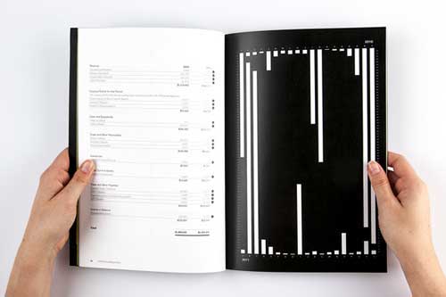
For every entry, we made sure to include at least three images, one for cover, an inside page and page for financial reports with graphs and charts. Link to the source is provided after the preview images.
BEST OF 2011-2012 ANNUAL REPORT DESIGNS
01-Gubretas Annual Report
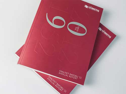
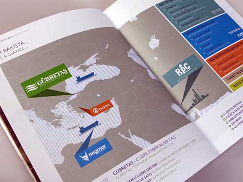
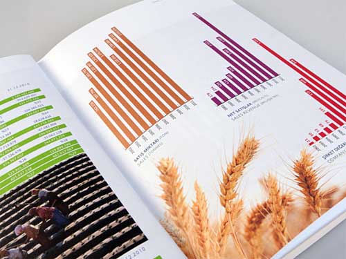
On top of our list for best annual report designs is from the first chemical fertilizer company of Turkey which is celebrating its 60th anniversary.
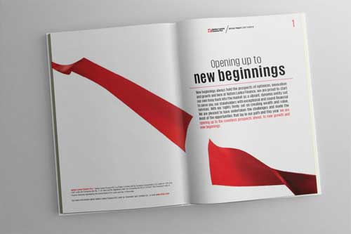
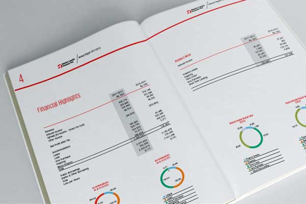
02-Nation Lanka Finance PLC Annual Report 2011/2012
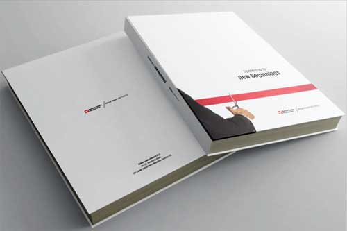
Second in our list of best annual report designs is a minimalist publication from a financial firm. The simplicity of this design makes this report look very elegant and luxurious.
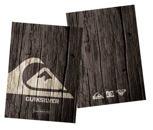
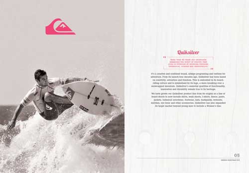
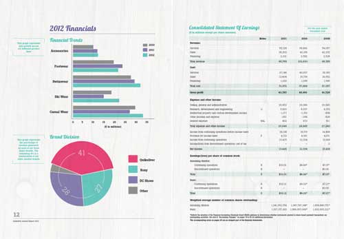
03-Quicksilver 2012 Annual Report (Concept)
The annual report designs below are not taken from the actual pages of Quicksilver’s Annual Report. Rather, this was done by a student as part of a design course. Quiksilver, as shown in the design, also includes the brands Roxy and DC Shoes.
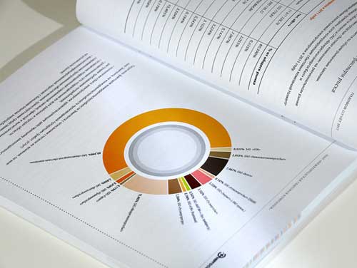
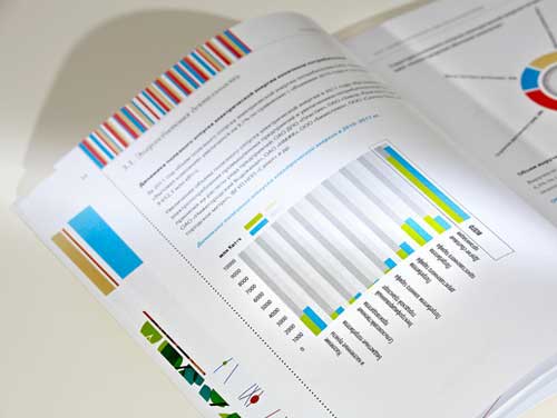
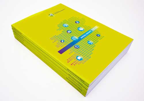
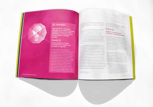
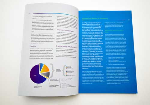
04-ComReg (Commission for Communications Regulation) 2012 Annual Report
Another beautiful aanual report designs for ComReg, Ireland’s statutory body responsible for the regulation of the electronic communications sector (telecommunications, radio communications and broadcasting transmission) and the postal sector.
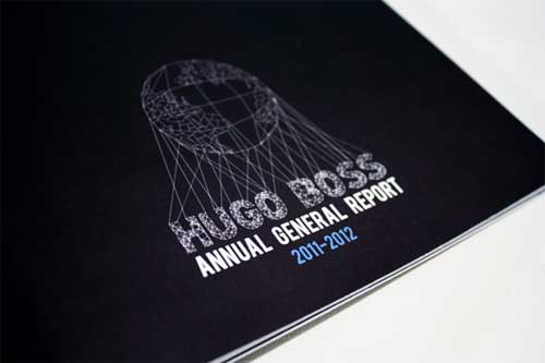
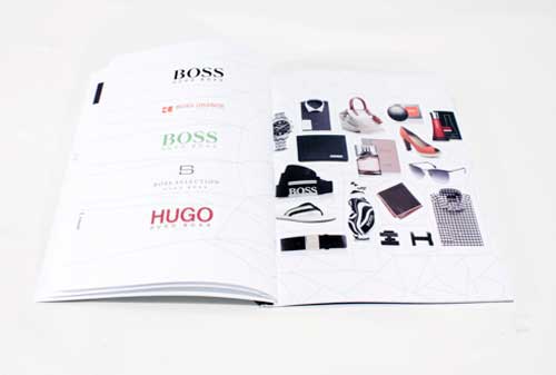
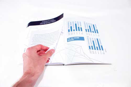
05-Hugo Boss Annual General Report (Concept)
Here is another student project for a design class. The proposed Annual General Report for Hugo Boss incorporates French style binding, with an extra fold out page for the Financial Tables.
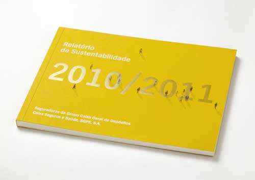
06-Caixa Seguros e Saúde Sustainability Report 2011
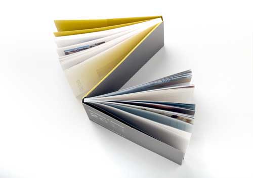
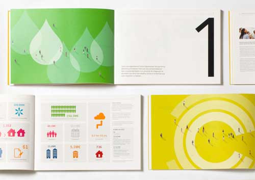
Included also in our roundup of annual report designs is the landscaped booklet in bright yellow against white background.
07-Valve Annual Report 2013
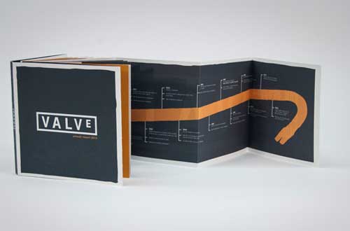
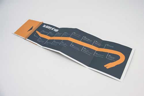
Here is another concept for the 2013 Annual Report of Valve, an interactive financial book for shareholders and fans.
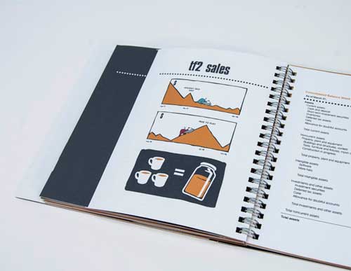
08-Vodafone Annual Report (Concept)
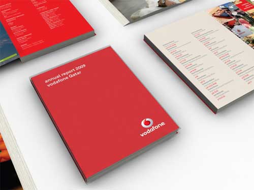
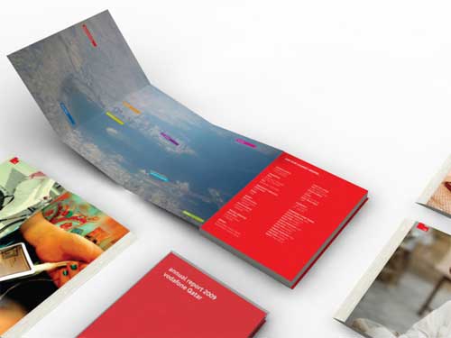
We also included in our list of best annual report designs a proposed design concept for Vodafone’s annual report. This report portrays the first year of its establishment in Qatar. This layout works in the form of diary or journal, where each page takes you to every employee’s journey/experience in this new foreign country.
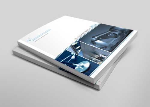
09-Outcomes Report
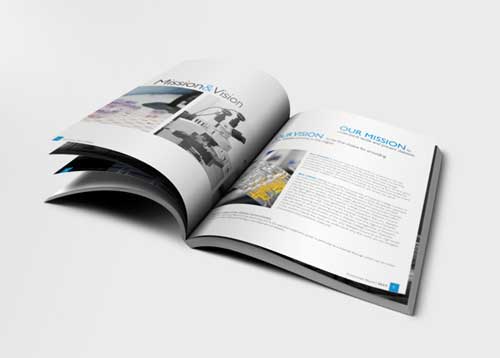
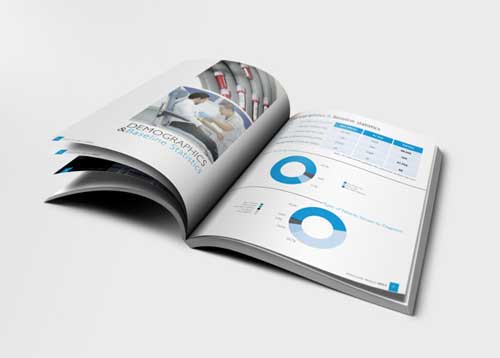
Yet, another beautiful example of annual report designs. This Outcomes Report 2012 for Imperial College London Diabetes Centre features a perfect-bound layout with clean and elegant inside pages.
10-Leica Annual Report
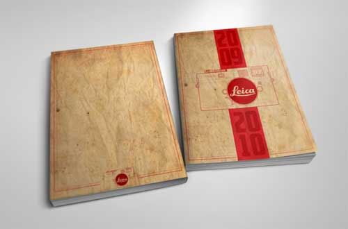
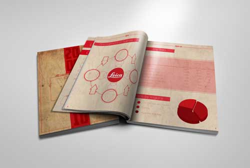
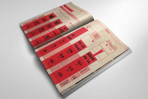
Here is another conceptual design, this time, for Leica. The design aims to create a vintage inspired report that catches and holds the attention of shareholders. The ddesigner chose a vintage style was to pay homage to Leica’s amazing history in the world of photo journalism and superior camera manufacturing that dates back to 1925.
11-Rainforest Alliance Annual Report
12-Seguros Pelayo Animated Annual Report
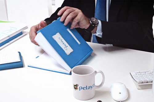
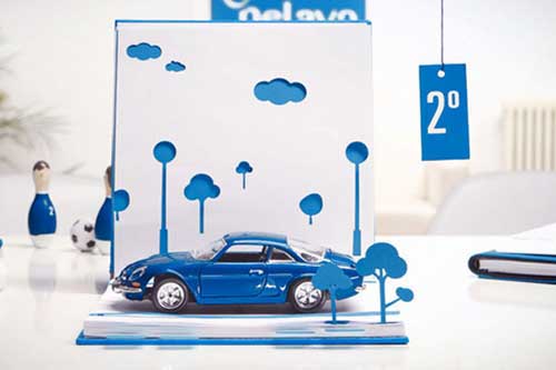
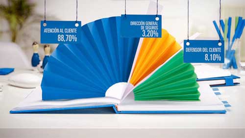
This design uses stop-motion animation. This annual report design for Spanish insurance firm features everything from cutout figures to an impromptu paper craft football match.
13-Clean and Simple Annual Report
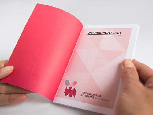
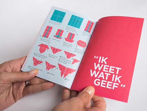
VIEW THIS DESIGN FROM SOURCE
14-The Solar Annual Report 2011
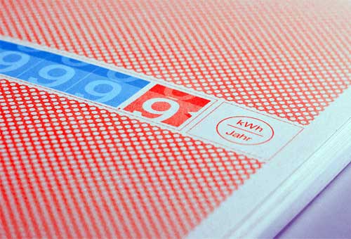
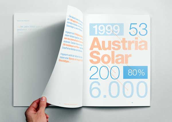
Here is a unique concept for annual report designs. This is probably the first annual report powered by sun. Its content remains invisible until sunlight falls on its pages. Indoors, the pages stay empty but as soon as you go outside the content becomes visible.
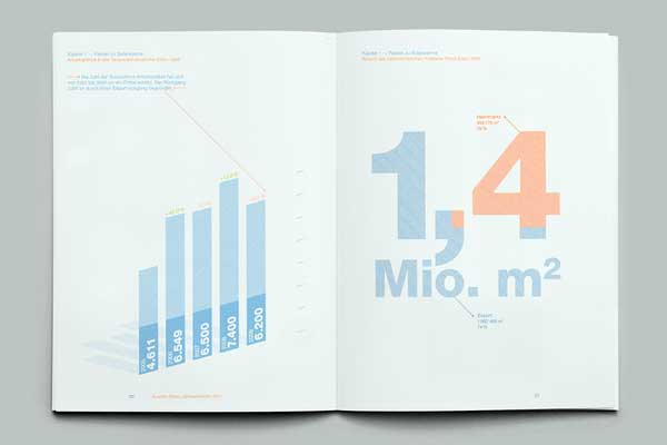
15-Annual Report and Accounts | Edifer 2010
Here is a design concept for a construction company.
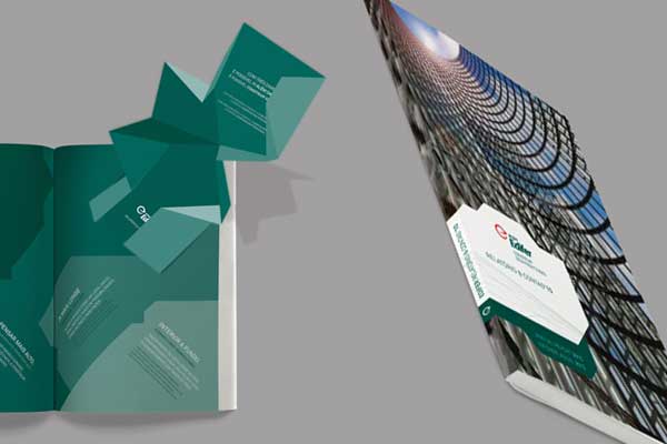
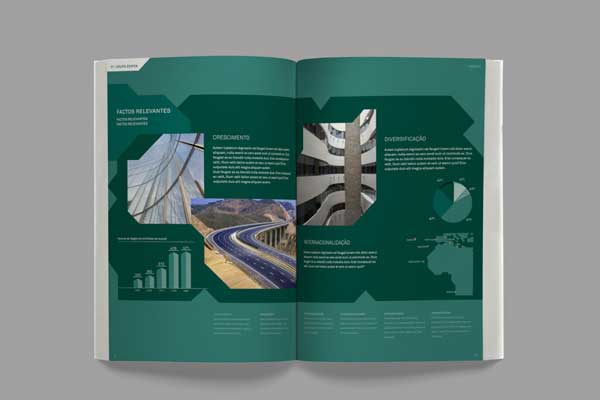
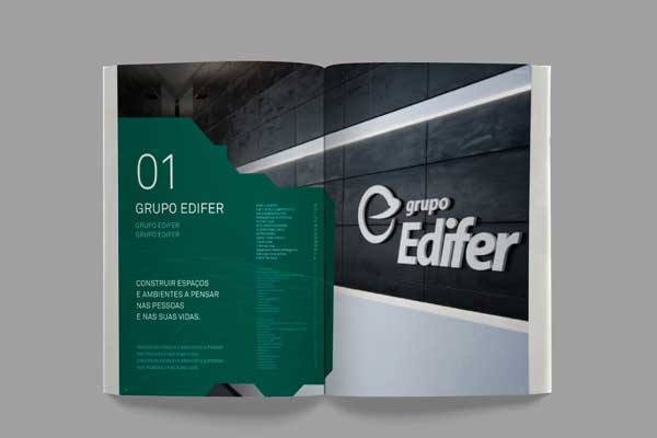
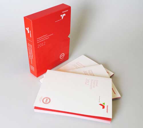
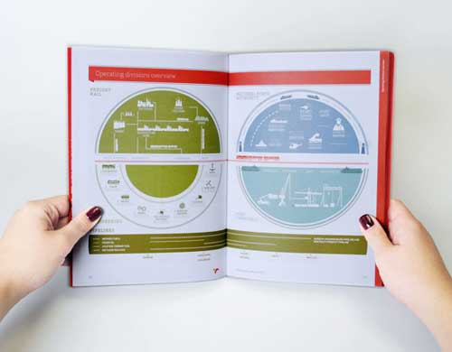
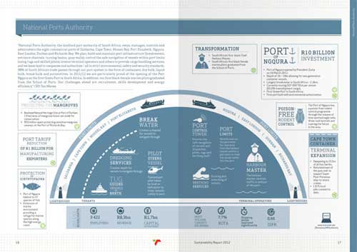
16-Transnet Integrated Report 2012
17-Craft Victoria Annual Report
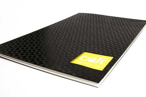
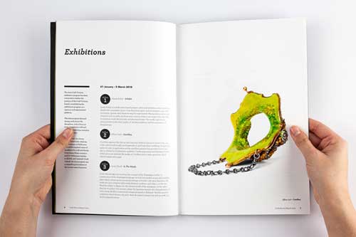
Here is an annual report design for a vibrant, curated program of contemporary art and craft exhibitions in Melbourne.
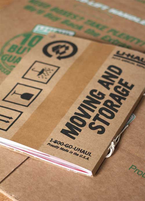
18- UHAUL Annual Report 2010
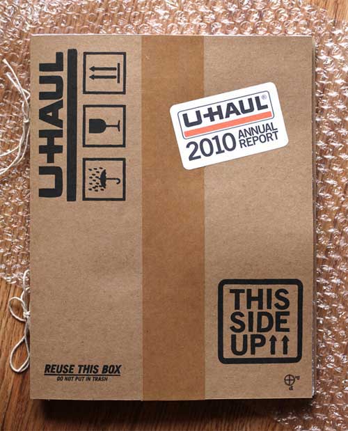
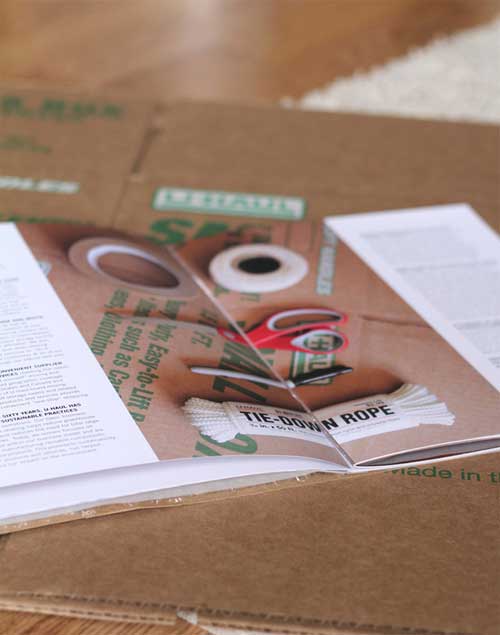
The concept behind the report is to position the company as a do-it-yourself company by using tactile imagery and materials. The images focus on the textures, tools, and materials for moving.
19-Heinz Annual Report
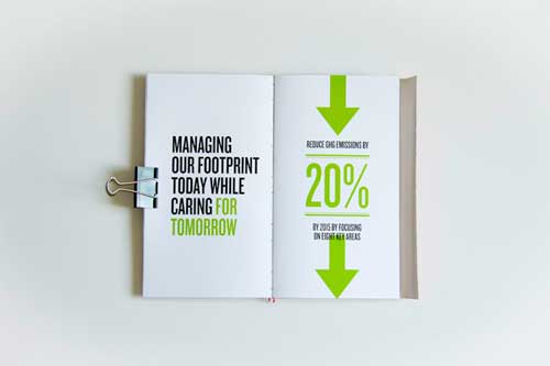
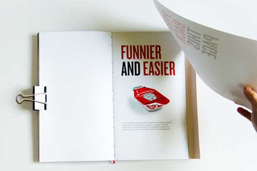
To access the Heinz products, consumers must make an extra effort: pull tabs, tear pods, taps the bottom of the bottle. This interactivity is transcribed in this 2011 annual report design by forcing the reader to manipulate the book instead of just turning the pages.

20-Croatian Post Progress Report 2011
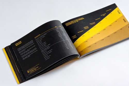
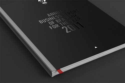
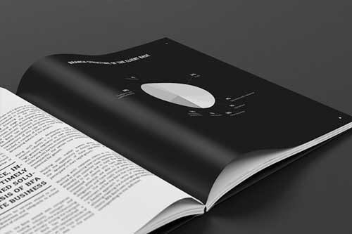
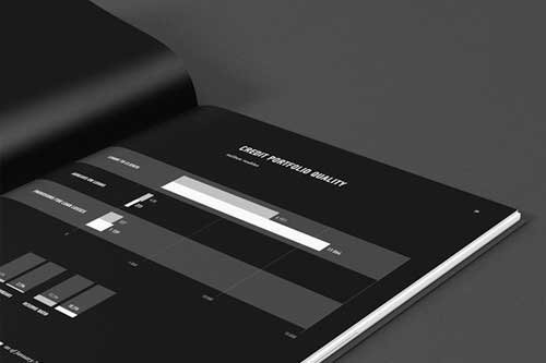
21-2011 Annual Report for BFA Bank
22-Pliva Annual Report
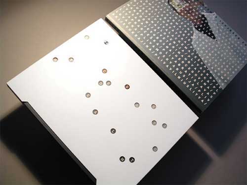
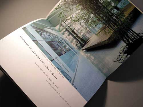
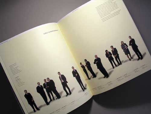
Annual Report for a pharmaceutical company. Perforations on the cover jacket reveal letters that make company’s motto: ‘Dedicated to Health’
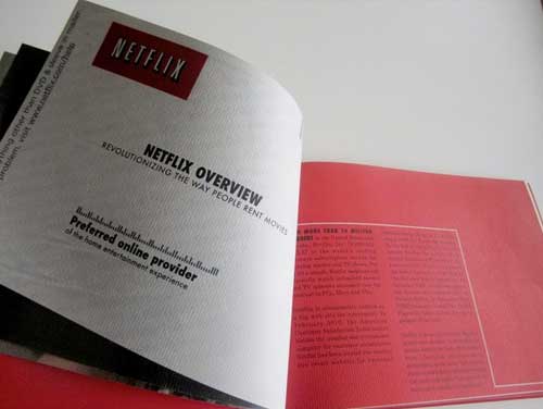
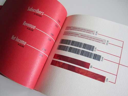
23-Netflix Annual Report
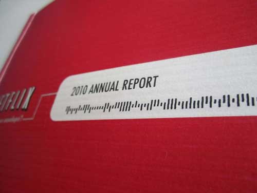
The size of the book is in proportion to the envelope and the inside is designed to simulate Netflix materials such as their envelope and movie sleeve.
24-Energosbyt 2012 Annual Report
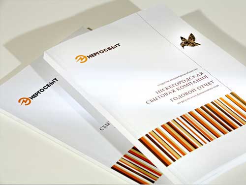
This report comes from a Russian company specializing on sales of energy for citizens in the region.
25-Austin Children’s Shelter Annual Report
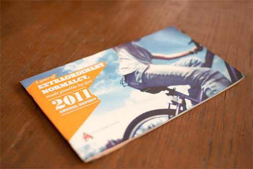
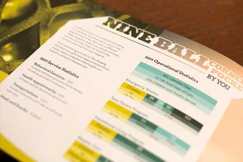
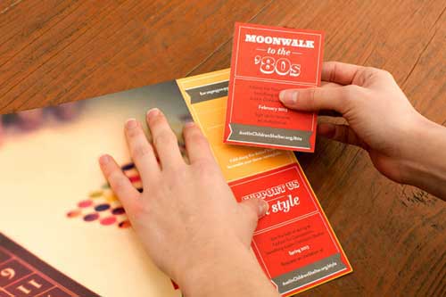
Last in our round up of annual report designs is the 2011 annual report of Mason Zimbler designed the ACS . It has a theme of “extraordinary normalcy,” highlighting efforts to give these kids the experiences most take for granted. The report also gave donors the tools to become advocates, with detachable cards featuring information about programs, special events and donor opportunities to share.
