Winter Colors: 9 Palettes for Web and Print Designs
Since the winter season is still on (at least for those living in the Northern Hemisphere), we decided to showcase various winter colors and palettes generated from photographs taken during winter time.
There are a number of ways to extract colors from what we see around and apply them in our design projects. The best way to do this based on experience is by extracting colors and hues in a photograph using programs like Photoshop and Photoshop Elements. We will not elaborate here on how to do this. Instead, we decided to come up with beautiful examples of color palettes using photographs and images.
Colors are often associated with certain emotions. That is why, in coming up with a design project, one of the first things that a designer has to decide is the color scheme or the series of color combinations or palette to use. One of the best sources for inspiration when it comes to the color palettes is nature because it provides colors that naturally draw the attention of people.
Nature in winter is all about subdued colors. The ground covered with snow minimizes visual clutter, giving you an almost monotone canvass. Falling snow acts somewhat like a white haze, casting a diffused veil over potentially busy backgrounds. During winter, blues tend to be cooler, especially those blue tones that drift toward purple. When these colors dominate a scene, we end up feeling a shiver, which is our emotional response to the color. However, winter hues should not be always monotonous. Sometimes, a muted color palette peppered with bright accents can make a canvass look more interesting. For example, a red berry covered with snow can make the image more interesting. And, if adapted to your web and graphic designs, the result could be very pleasing to the eye.
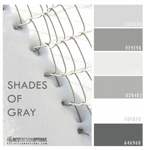
Winter Colors – Shades of Gray
Picture of fence half covered with snow. The combination of the different cool shades of gray make this palette looks very serene. This palette could be used for minimalist designs.
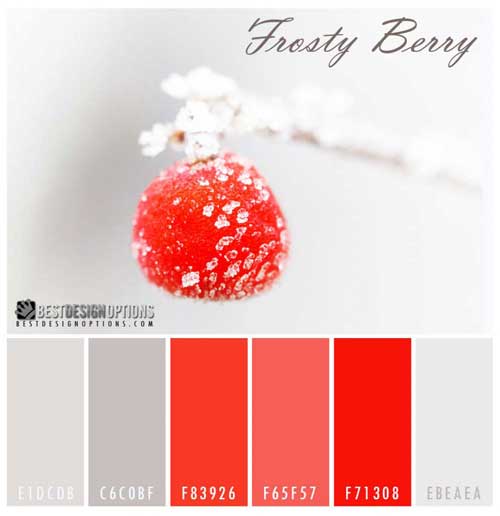
Winter Colors – Frosty Berry
Image of a red berry fruit covered with ice. I love the high contrast brought by an almost white backdrop against a bright red berry. Makes me think of ice cream. This color palette could be used for food-themed designs.
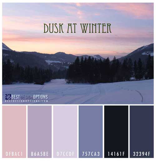
Winter Colors – Dusk at Winter
The pinks and soft purple sky, when combined with dark silhouettes of mountains and trees, can produce a very calm color palette. Unlike during summer where the sky turns bright orange at dusk, winter time produces on the other hand hues closer to blue, gray and purple. This palette looks very feminine, thus, suited for women-related design projects.
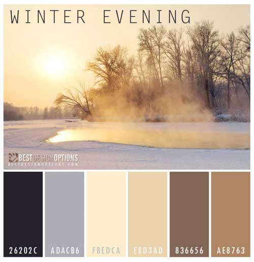
Winter Colors – Winter Evening Hues
At evening, the sky tuns pink and the light coming from the setting sun produces soft brown colors. This palette is composed of soft pastels that are excellent for projects requiring muted colors.
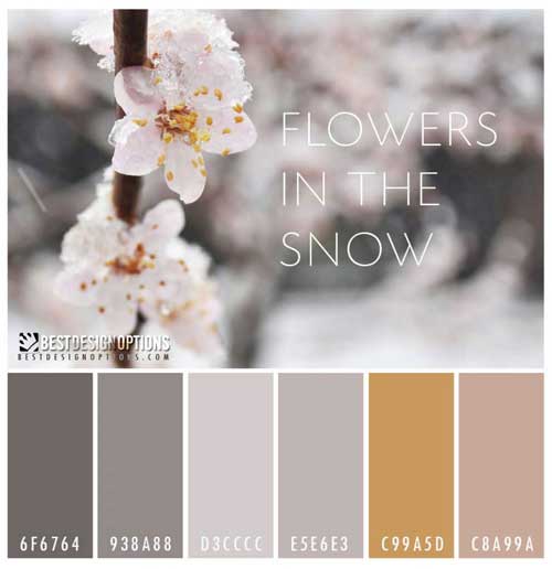
Winter Colors – Flowers in the Snow
These are cherry blossoms partly covered by snow. The colors extracted from this images are almost similar as the previous one.
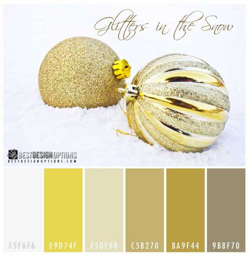
Winter Colors – Glitters in the Snow
Gold Christmas balls buried in snow.
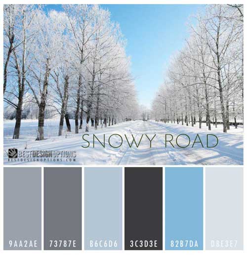
Winter Colors – Snowy Road
Picture of a road lined with trees covered with snow. The cool blues are very pleasing to the eye and perfect for a web design project.
Winter Colors – Thistles Teasles
Almost monochromatic, this color palette is ideal for minimalist designs. I am thinking of designing a business card based on this color combination.
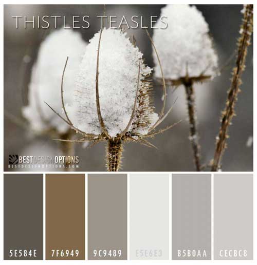
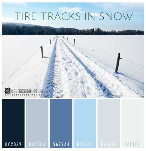
Image of a pathway with tire tracks. The blue sky and trees lined at the horizon produce a contrast to a rather bland foreground of snow. Again, this palette is perfect for a branding of a business.