30 Excellent Brochure Design Examples
Brochures are one of the most powerful marketing tools for companies and organizations. Through brochures, companies are able to tell people about their products or services as well as their mission/vision as a company or organization. In a brochure design, it is important to consider the choice of color scheme, the size of the brochure, as well as the printing process and the type of paper. Well, these are just some of the major considerations when conceptualizing a brochure design. I am sure you have a long list of other aspects to put into the picture when working on this type of design project.
When designing a brochure we always look up first for inspiration and the best place to search for inspiring designs is the Web. Like in web design, designers also look for inspiration by looking at certain design trends. As a starting point for you, we compiled in this post the 30 best brochure design samples that we found from all over the Internet. I hope that you will also find some inspiration in this list of brochure designs especially if you are feeling like you are running out of artistic ideas.
If you need more design examples, then check out also our earlier post on magazine layout design ideas.
30 BEST BROCHURE DESIGN EXAMPLES
Know more about each brochure design example by visiting the source. To do that, simply click on the title of the entry.
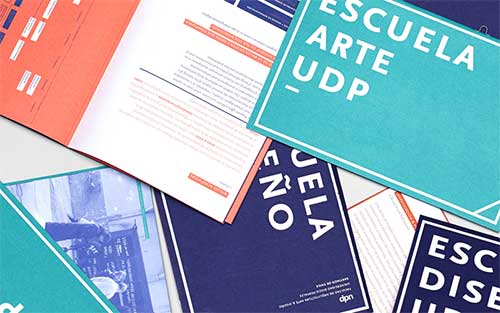
01. Faculty of Architecture, Art and Design Brochure
This informational brochure features bold colors and typography to share the various bits that prospective students need to know about the faculty.
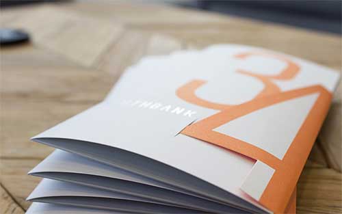
02. Creative Office Tour Collateral
A new brochure for a design company featuring pocketed brochure/folder with silver foil and a clever flap enclosure.
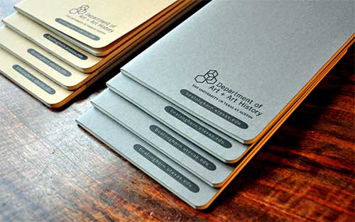
03. UT Austin Art + Art History Admissions Materials
An admissions brochure that also serves as a poster for teachers to hang in their classrooms. The accompanying Moleskines are for jotting down notes about where to find the best breakfast tacos.
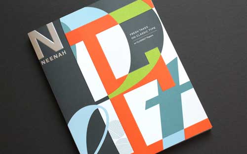
04. Neenah Papers Promo Brochure
Here is a paper promotional brochure featuring small and big pieces that pull in and out or assemble and disassemble. It focuses on typography using six typefaces to showcase different papers with various cutouts and fancy printing techniques.
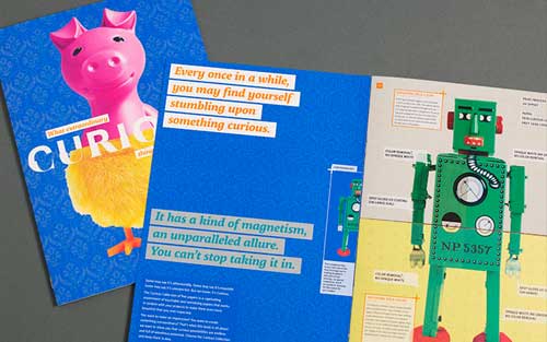
05. Appleton Coated Brochure
This brochure makes very excellent use of varnish and coatings in its design.
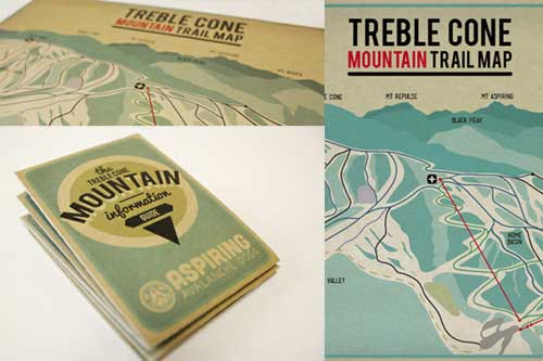
06. Treble Cone Mountain Guide
A mountain information booklet for the Aspiring Avalanche Dogs Inc, a nonprofit organization. This brochure design features a simple look using vector design elements with a casual and quirky feel that would suit the style and character of the skiers and snowboarders at Treble Cone.
07. Brochure for Designers
A portfolio brochure designed for designers. A series of vibrant colors were used to represent the style of design. This is an example of a portfolio brochure that will attract the audience even without them flipping through it.
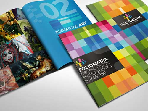
08. Media Pro Brochure
This brochure was designed for a London-based event focused on the future of integrated marketing and communications. Two sets of shapes overlay and integrate to reveal the intended message.
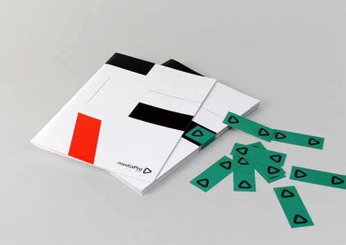
09. Unique Brochure Design
This unique brochure design uses a fastener in one corner to give a whole new page orientation.
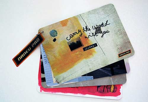
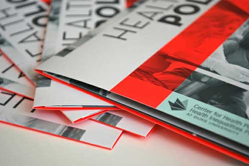
10. Minimalist Three-Color Brochure Design
A three-color gatefold brochure design done for Duke’s Center for Health Policy. This piece uses a fluorescent red color.
11. Black and White Booklet Brochure
This brochure was designed in a bright, creamy color palette with retro style photography. To make it more coherent, the publication is wrapped in a paper stripe.
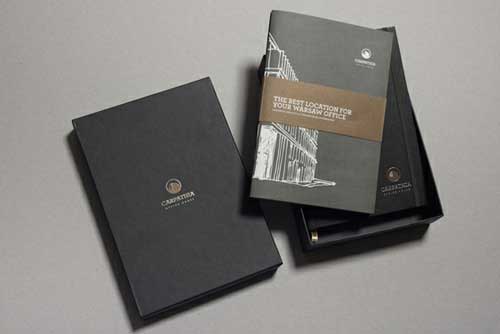
12. The Book Shelf Brochure
This brochure was designed for a Library run by volunteers for the local community. It was envisioned as a state of the art library that included various sections situated at the heart of the community, serving as a central hub for knowledge and creativity. To go along with this type of library, a very clean and stripped down design were used to reflect honest and good business.
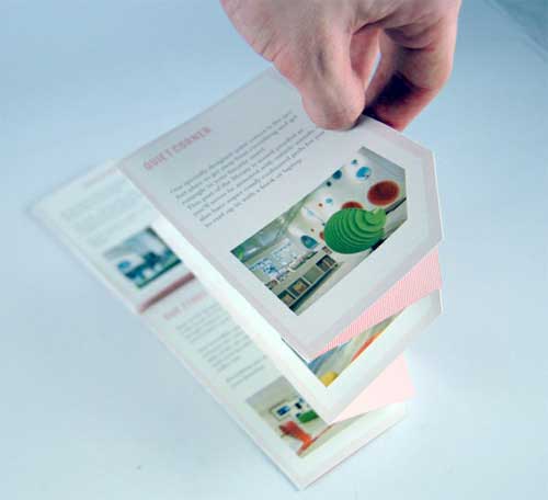
13. Simple and Elegant Brochure
The use of solid colors and lots of white spaces make this brochure design look very elegant and attractive.
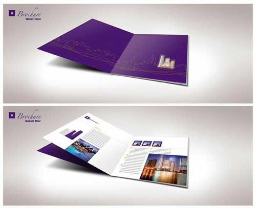
14. Advertising Brochure
An advertising brochure for a fictitious company that does not only specialize in fashion but also interested in lifestyle and sports.
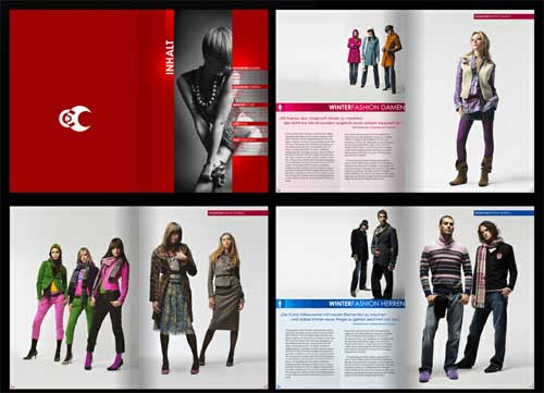
15. Vintage Style Brochure Design
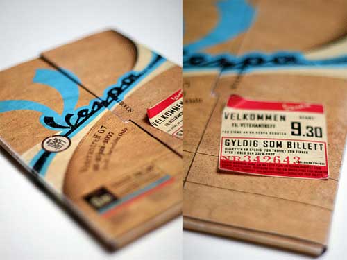
This is the brochure design for a veteran show in Norway. The vintage look was achieved using old paper textures.
SOURCE
16. Landscape Booklet Brochure Design
This is a proposed brochure design for a local company.
17. Subdivision Real Estate Brochure
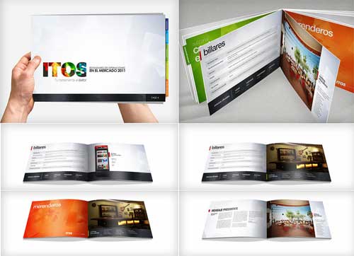
A brochure design example for a residential subdivision in Abu Dhabi. This real estate brochure uses a simple design featuring colors of the brand and a few die cuts that serve as subject dividers. The spiral binding was also used in this brochure.
18. Real Estate Brochure Design
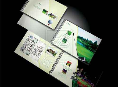
Here is another brochure design for a real estate business. This brochure was for a project that sells contemporary living spaces – high-end luxury villas, complete with modern amenities. The focus was to design a brochure with nature as the fountain of inspiration.
19. Folder Brochure Design
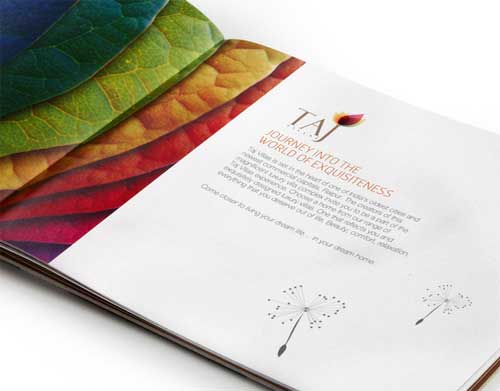
The brochure design features illustrative photography to showcase the companies core services. The cover doubles as a pocket folder to house additional company literature.
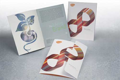
20. Clean Corporate Brochure
This brochure was intended for a real estate company.
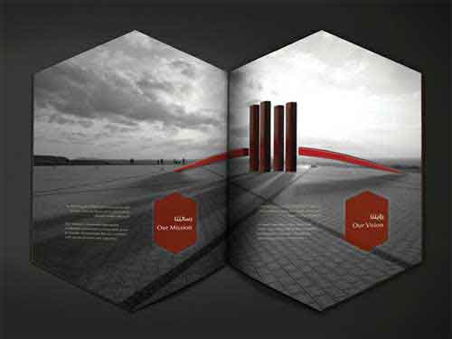
21. Cream fields-Bible Style Brochure
With a leather de-bossing style for covers and three separate sections, the ‘bible’ documents the success of the company’s events worldwide. The book-style brochure design makes use of a single lanyard to hold it together.
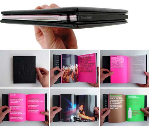
22. Advanced Digital Identity Brochure
The Advanced Digital Institute is an independent research and development institute in West Yorkshire. The optical nature of the ADI logo reflects their work, in contrast, the spacious photography brings a human element to the brand. The dot matrix grid underpins everything the company does.
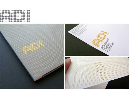
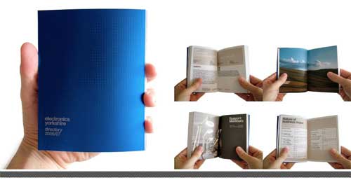
23. Electronics Yorkshire Directory, 2007
The directory is a pocket-sized source for regional electronics related companies, institutions, and funding organizations. Bound in an embossed board, the directory follows a simple grid and indexing system for ease of use.
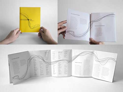
24. Silkroad Project Brochure
This is a brochure and poster for The Silkroad Project. The musical ensemble focuses on creating a flow of connectivity among different cultures across the world. Lines flow throughout the brochure and meet at each fold to eventually fold out into a poster.
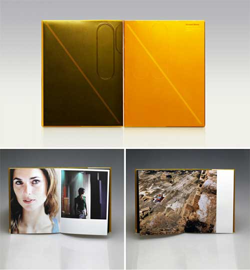
25. Richard Moran Photography
This brochure design in book form documents the photographic direction of Richard Moran over the past few years, focusing primarily on people, movement and observation. It comprises three high gloss image sections and three un-coated text sections and printed in full color.
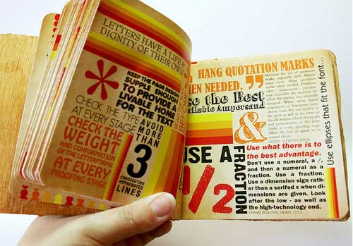
26. Typography Book 2
This typography book for typography course sports a vintage look and unique size.
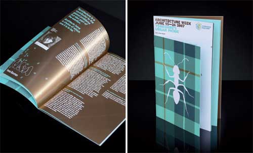
27. Urban Picnic Event Brochure Design
This brochure design makes use of ant and blanket pattern graphics to interpret the common picnic in this event brochure for Architecture Week. Using architecture stencils as the basis for the typography, the brochure has contrasting colors which reflect building materials.
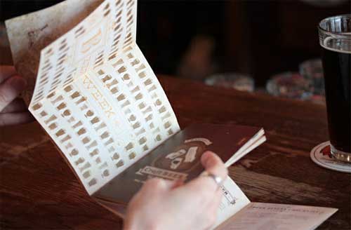
28. 2012 Madison Craft Beer Week Field Guide
This brochure aims to promote a week-long festival celebrating all that is craft beer, with events throughout Madison and the surrounding area. This brochure acts as the field guide for all the festivities and featured a bonus, fold-out poster cover.
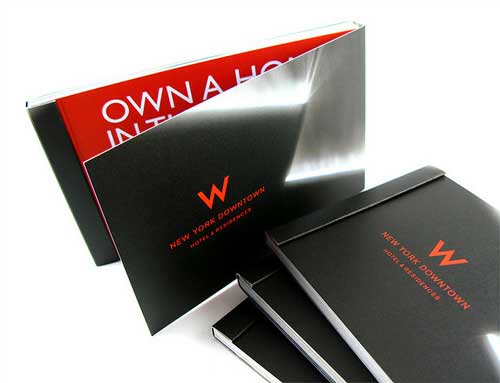
29. W Hotel New York Brochure
These brochures give prospects a peek at the awesome new W Hotel on Washington Street in Downtown NYC and its amazing residences.
30. A5 Brochure Design
A5 Brochure Design to advertise the events and exhibitions at the MCA in Sydney.
