10 Bright Color Palettes Inspired by Delicious Fruits
Fruits are blessed with bright colorful hues that we can use for our designs. From tangy yellow pineapple to shiny red berries, fruits will surely help us put attractive color schemes together. In this post, we are sharing ten bright color palettes inspired by delicious fruits such as green avocados, blueberries, grapes, lemon, orange, among others.
Mother Nature remains the best source for inspiration when it comes to powerful color schemes and palettes. Fruits, in their many and varied forms, can be a great inspiration for bright color palettes for our design projects like home decorating, planning weddings and other events. Fruity colors are also perfect for eye-catching web design, web banners, posters, and other printed designs. With Spring and Summer coming, I am sure we will be seeing more of these bright color palettes.
FRUIT-INSPIRED BRIGHT COLOR PALETTES
Fruity bright color palettes are simple, yet elegant and you find them everywhere. The bright color palettes below show the picture of the fruits where the colors or hues were derived from. In addition, you can get the corresponding hexadecimal code for each color in the palette. If you find these bright color palettes useful, please share them on Facebook, Pinterest, and other social sharing media. Thank you in advance.
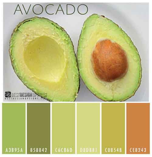
Green Avocado
The green buttery flesh of a ripe avocado provides a very interesting color scheme that’s easy on the eyes. Avocado green is commonly used for metal surfaces, including automobiles and household appliances. The combination of light yellow-green and almost creamy vanilla in this palette could make a very interesting interior for your home.,
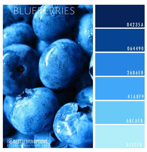
Blue Blueberries
Don’t you just love blueberries? Here is a color palette featuring different shades of blue that will surely work with neutrals like white and gray.
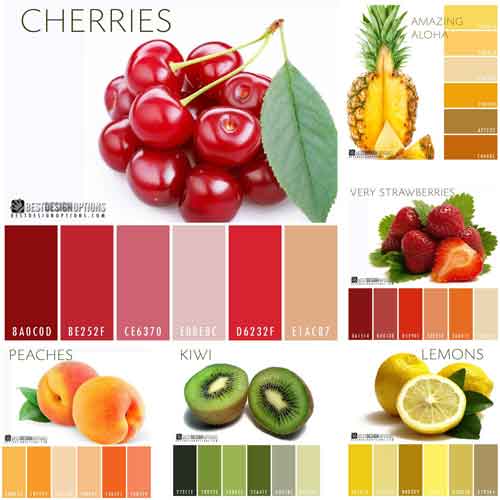
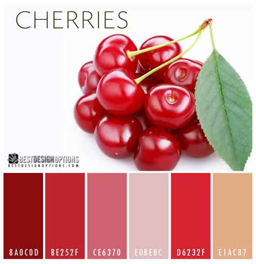
Red Cherries
Designing with reds can seem a little overwhelming to many people as there are many shades of red. Cherry red is more of a pink-red, therefore it is a little less daunting to use.
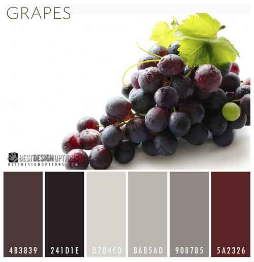
Purple Grapes
The purple shades in grapes provide a range of options, from bold and energetic to soft and romantic, depending on the shades you use. The dark purple shades in this palette could be useful for achieving a touch of elegance in your designs.
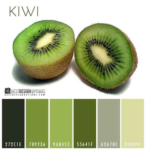
Kiwifruit
If you need a muted green palette, this color scheme inspired by kiwifruit with its brown skin, bright green fruit, and black seeds, could help you achieve that look easily.
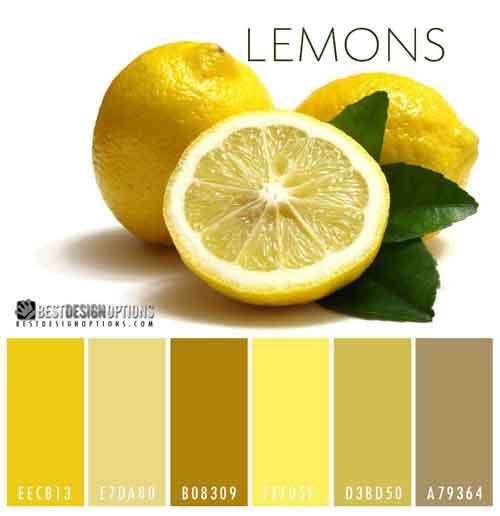
Yellow Lemons
Just by looking at this palette can make you salivate. It reminds you of those ice-cold freshly squeezed lemonade during hot summer days. Thus, these colors are perfect for summer-themed designs.
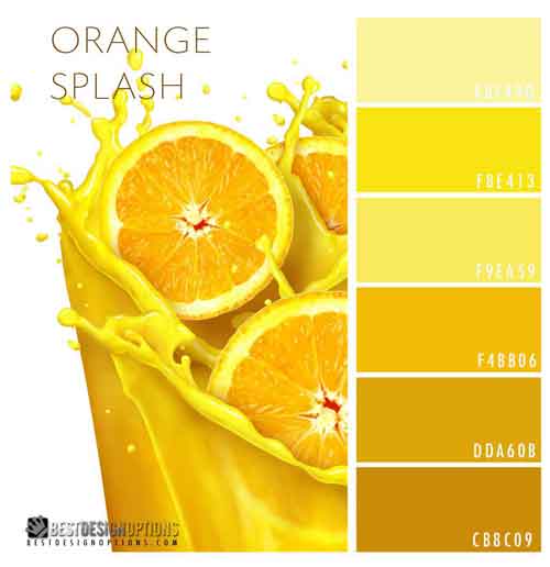
Orange Splash
Orange is vibrant. This color is hot, healthy, fruity and engaging but it can also be abrasive and crass. It’s a polarizing color. People either love it or detest this color. So use this palette with caution. If you find it too bright, you can always use a lot of white in your design.
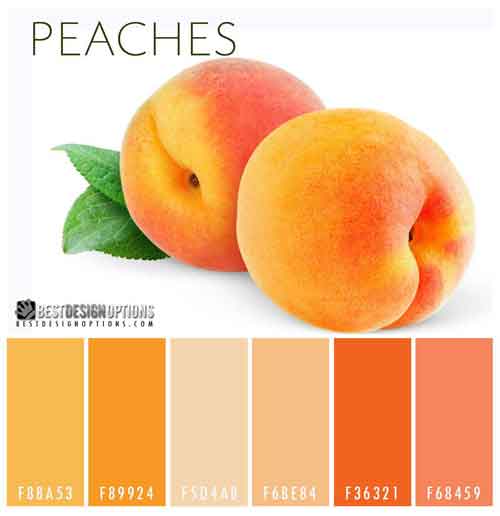
Peaches and Cream
Sweet but sophisticated, the color peach is a popular wedding color scheme. The palette below includes peach and classic cream, a combination that is fresh, modern, and gloriously memorable.
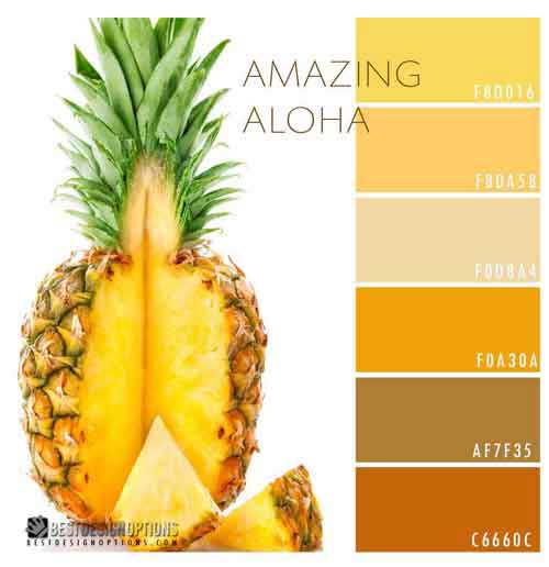
Amazing Aloha
The bright yellows of pineapple fruit can light up any design. By far the happiest color in the spectrum, yellow is always apt to cheer up and lighten the mood of anyone looking at your designs. The palette below includes yellow shades that are bright as the sun and also tones that are quite as a fallen leaf in autumn. Bring a little sunshine into your life with these uplifting yellows.
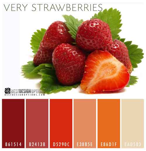
Very Strawberries
I love the red, pink, and orange color palette–shades found in a strawberry palette.