The Very Best 10 Commercial Serif Fonts
Historically, designers and publishers prefer to use serif fonts in book and magazine publishing since these are the most legible typefaces in longer passages. In modern days, sans serif fonts remain popular because of their associations with 20th Century Modernism. Today, we look at the 10 best serif fonts that you can use in your designs, especially in designing inside pages of a book or magazine layout.If you have no idea what serif fonts are, these are typefaces with a small decorative line added as embellishment to the basic form of a character. To illustrate this, just scroll down and look at the 10 best serif fonts we included in this post.
10 BEST SERIF FONTS YOU SHOULD TRY
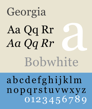
Georgia
First of all, this typeface looks very similar to Times New Roman. As one of the best serif fonts, Georgia is the serif companion to the first Microsoft sans serif screen font Verdana. It is designed for clarity on a computer monitor even at small sizes, partially due to a relatively large x-height.
[ SOURCE ]
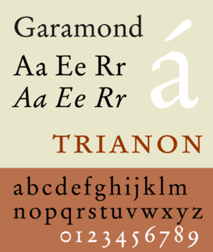
Garamond
Another candidate to the best serif fonts is Garamond. There are many versions of this serif font. However, the Adobe Garamond version is the most used version today. Garamond’s letterforms convey a sense of fluidity and consistency. Its unique characteristics include the small bowl of the a and the small eye of the letter e. The letters also have long extenders and the top serifs have a downward slope. Garamond is a great serif font for long bodies of texts such as in magazines, textbooks and websites
[ SOURCE ]
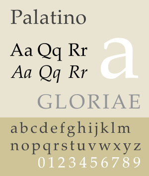
Palatino
Another typeface that we consider as among the best serif fonts is the Palatino. This serif font is widely used for both body text and display type. The reason for its popularity is maybe because of its inclusion— along with Helvetica and Times — in the Mac OS. Also in the Palatino family are the Palatino Linotype, Palatino nova, Palatino sans, Palatino sans informal and Palatino Arabic.
[ SOURCE ]
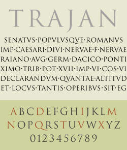
Trajan
Next in line when it comes to best serif fonts is Trajan Pro. Trajan is an old style serif font designed in 1989 for Adobe. The design is based on Roman square capitals, as used for the inscription at the base of Trajan’s Column from which the serif font takes its name. Trajan is among designers’ favorites in designing many of Hollywood’s movie posters.
[ SOURCE ]
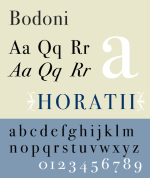
Bodoni
Likewise, we believe that Bodoni should be among the best serif fonts. Designers mainly use this serif font for headlines and logos. Bodoni has a narrow underlying structure with flat, unbracketed serifs. The face has extreme contrast between thick and thin strokes and an overall geometric construction which makes it a very aesthetic looking font. Bodoni is popular for a wide variety of materials, ranging from eighteenth-century Italian books to 1960’s periodicals.
[ SOURCE ]
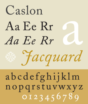
Caslon
Also one of the best serif fonts, Caslon features short ascenders and descenders, bracketed serifs, moderately-high contrast, robust texture, and moderate modulation of stroke. Caslon and its variants are good, readable choices for text.
[ SOURCE ]
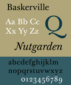
Baskerville
Many consider this serif font a classic typeface dating from the 1750s. The many variations of Baskerville and New Baskerville serif fonts work quite well for both text and display use.
[ SOURCE ]
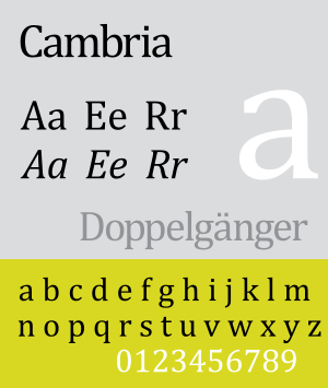
Cambria
Cambria is part of the suite of serif fonts that come with Microsoft Windows Vista, Microsoft Office 2007 and Microsoft Office 2008 for Mac. This serif font is specifically designed for on-screen reading. Likewise, it is aesthetically pleasing when printed at small sizes. Cambria also features even spacing and proportions, with strong diagonal and vertical hairlines and serifs. Horizontal serifs, on the other hand, are small to emphasize stroke endings.
[ SOURCE ]
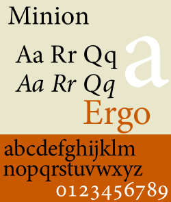
Minion
It comes in PostScript format and supports ISO-Adobe character set. A unique feature of Minion is the support of Regular and Display optical sizes in Regular and Italic fonts. The different optical sizes of this serif font have different stroke contrasts and details, designed to optimize texts for specific applications. Minion Black does not have an italic counterpart.
[ SOURCE ]
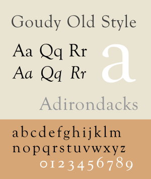
Goudy Old Style
Lastly, Goudy is suitable for both text and display applications. This serif font is a graceful, balanced design with a few eccentricities. The upward-curved ear on the g and the diamond shape of the dots of the i, j, and the points found in the period, colon and exclamation point, and the sharply canted hyphen are quite unique.
[ SOURCE ]
So, there goes my list of favorite serif fonts. Likewise, check out my article about best sans-serif fonts (if you haven’t read it yet).
Credits: Images from Wikipedia


