20 Interesting Infographics Design Examples
To inspire you in designing your own infographics, we rounded up 20 of the most interesting, creative and probably the best infographics design examples. These infographics design examples cover topics from the global financial crisis to global warming as well as the history of beer to the composition of your favorite coffee drinks.
Information graphics, popularly known as infographics, are visual representations of data, statistics and other quantitative information. Raw data such as numeric data is meaningless for an average person. It also looks boring for most people that we usually ignore them. Thus, in order for information to be interesting and understandable by common people like us, infographics are being used to quickly convey these bits of knowledge.

EXAMPLES OF INTERESTING INFOGRAPHICS DESIGN IDEAS
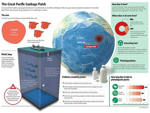
The Great Pacific Garbage Patch
Where do all the garbage in the Great Pacific come from and where do they usually go? Find out in this infographic design created by 5W Infographics España.
[ SOURCE ]
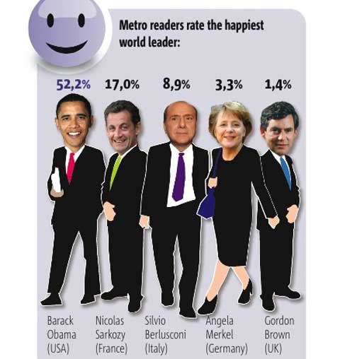
Happiest Leaders in the World
Find out who among the world leaders is the happiest in this information graphic based on the ratings given by Metro readers. Obviously, it’s US President Barrack Obama who got the top spot. This infographics design is also created by 5W Infographics España.
[ SOURCE ]
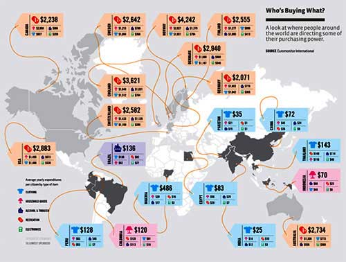
Who’s Buying What?
A look at who or what country around the world is buying what product or commodity. It also shows where people in different countries are directing their power. Types of items included in this information graphics are clothing, household goods, alcohol and tobacco, recreation and electronics. I wonder if food is included in household goods?
[ SOURCE ]
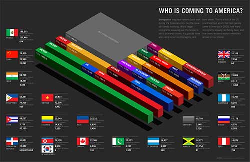
Who is Coming to the US?
This infographics design shows the 20 countries from which most settlers/migrants in the United States in 2008 came from, how many of them have family in the US and how many received asylum when they arrived in the US.
Infographics Resume of Michael Anderson
A resume that would surely stand out from the rest. This is really creative and if you’re looking for a creative job, this kind of resume is will surely get you the job! The author did not only succeed in creating great graphics, but he also proved he could turn ‘boring’ facts and figures into something exciting.
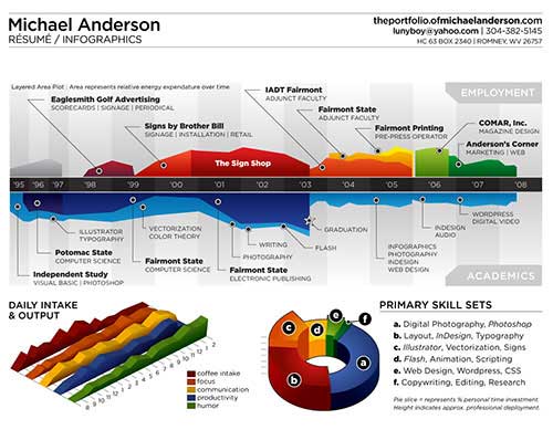
[ SOURCE ]
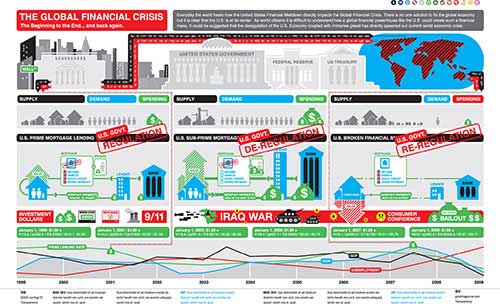
Global Financial Crisis
We all heard how the United States Financial Meltdown directly impacts the Global Financial Crisis. However, it is difficult to understand how a global financial powerhouse like the US could create such a financial mess. Here is an infographics design to help us understand how and why the global financial crisis came into being.
Coffee Drinks Illustrated
Interested to know what’s in the coffee you buy from Starbucks (or any other coffee shops)? Here’s an infographics design showing the proportion of ingredients in various coffee drinks. And, oh, the information graphics also teach you the pronunciation of each coffee drink type.
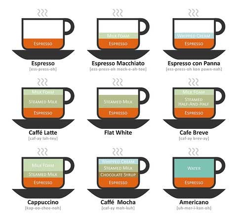
[ SOURCE ]
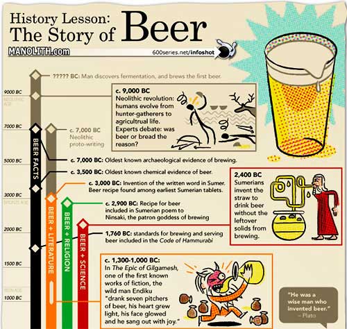
History of Beer Infographics
Trace the history of beer in this infographics design.
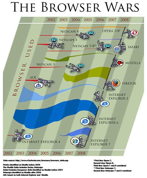
The Browser War
Find out what’s the hottest browser in the world today plus a little bit of history. From being the dominant browser starting 2003, Windows Explorer 6 was gradually overtaken by Firefox by 2008.
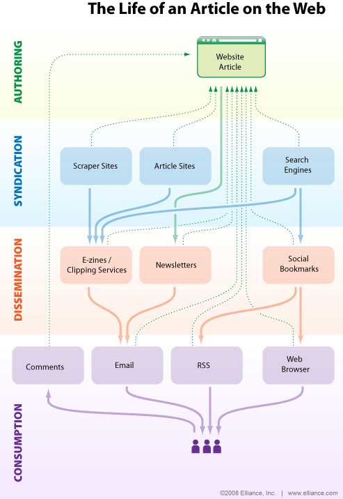
SEO Infographics
When it comes to SEO, content is king. But, have you ever really thought about how many touch points a well-written and well-optimized piece of content encounters on the web? This infographics design demonstrates exactly how an optimized article can find its way to its target audience.
[ SOURCE ]
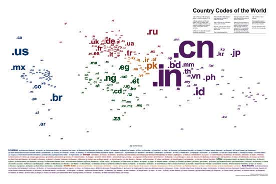
Country Codes of the World
Although dot-com is the world’s most popular top-level domain, it is far from alone. There are more than 260 top-level domains in use around the world, most of which are country code top-level domains. Each two-digit code in the infographics design is aligned over the country it represents and is color coded with the legend below for quick and easy reference. Each two-digit code is sized relative to the population of the country or territory, with the exception of China and India, which were restrained by 30% to fit the layout.
[ SOURCE ]
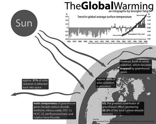
Global Warming
An infographics design to help us better understand the factors contributing to global warming.
[ SOURCE ]
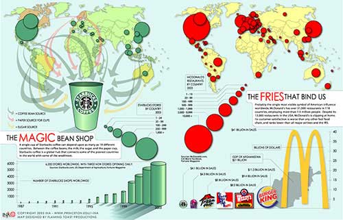
Starbucks and McDonald’s Infographics
This infographics design shows how two major American brands, Star Bucks and Mcdonald’s, are proliferating across the world.
[ SOURCE ]
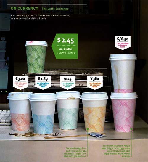
On Currency
How much does your morning cup of coffee cost in other countries? Have a look at how much a single 12 oz. Starbucks latte in world currencies, relative to the value of the U.S. dollar.
[ SOURCE ]
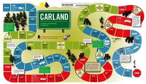
On Driving
The first Model T rolled out in 1908. In-N-Out introduced the drive-through in 1948. The first car phone—weighing 90 pounds—was released in Stockholm in 1956. These and other landmarks from a century of motoring in America.
[ SOURCE ]
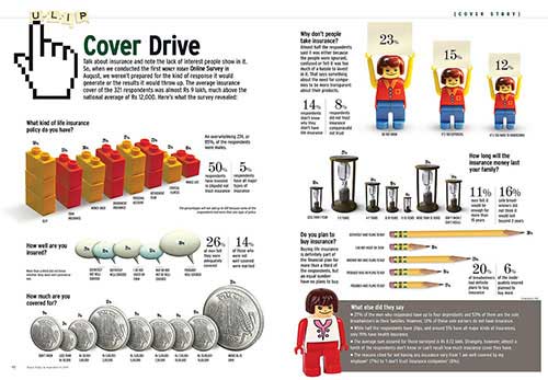
Cover Drive
This infographics design talks about insurance and the lack of interest people show in it. More than half the people surveyed said people do not take insurance because they were either ignorant, confused or felt it was too much of a hassle to invest in it.
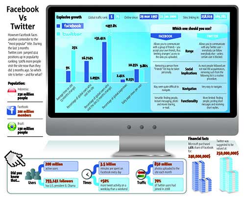
Facebook vs. Twitter
Which one should you use: Facebook or Twitter. I would say both! Let us take a look at this infographics design that put Facebook and Twitter side by side. Some people may say that the data in this infographics design inaccurate. But it’s worth checking out.
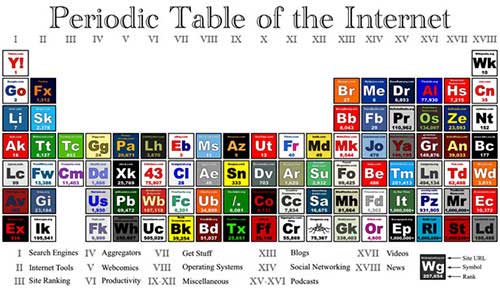
Periodic Table of the Internet
An infographics design representing some of the internet’s most popular sites in a familiar layout.
[ SOURCE ]
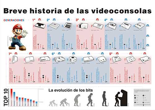
Video Games History
This infographics design is non-English but it looks stunning, nonetheless. I think it talks about the history of video consoles and games.
[ SOURCE ]
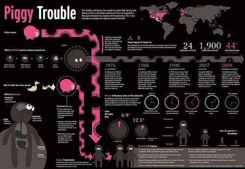
Swine Flu: the Piggy Trouble
An infographics design aimed at educating people about the swine flu, which is, by the way, is the new pandemic.
[ SOURCE ]