20 Inspiring Magazine Layout Designs for Inspiration
Designers have to be very creative in coming up with unique and creative magazine layout designs. Since designing magazines are more challenging compared to other types of publications, a designer usually encounters creativity block when conceptualizing designs for a magazine.The magazine cover is an important part of the magazine design process since it usually creates the initial impression of your publication. And, the first impression usually lasts, right? However, the key to getting the attention of the readers and make them read the magazine from cover to cover does not depend on the magazine cover design. Instead, readers are enticed to read a magazine if it has an enticing, easy-to-read layout and design for the inside pages.
So how do you achieve creative, consistent and visually appealing content for your magazine? Here, we decided to pool together in this post a showcase of 20 creative magazine layout designs.
In viewing these examples, be aware and critical about the main elements or factor that we give importance to when designing the inside pages of a magazine. These factors include the typeface used for headlines, sub-headlines, and the body. Likewise, the color palette or combination of colors used, the paragraph style, the folio, the styles applied to images also count.
Another part of the inside page of a magazine the designers frequently give less attention is the table of contents design. These are some of the elements that we set in our templates, master pages or style sheets when doing the layout in Adobe Indesign or other desktop publishing programs in order to create a coherent look for a particular publication or magazine from cover to cover.
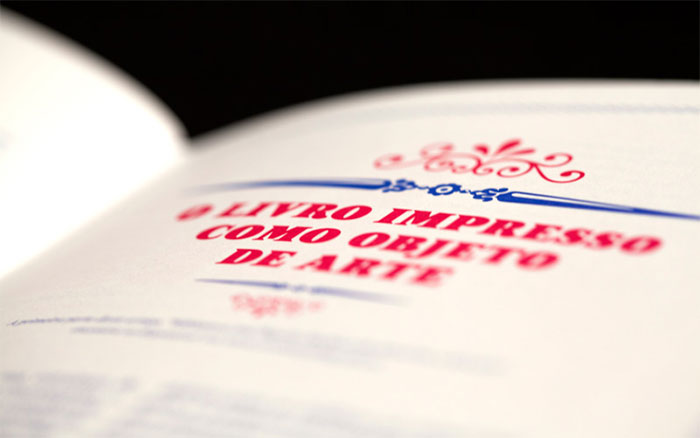
EXAMPLES OF MAGAZINE LAYOUT DESIGNS
We tried our best to include visually appealing, interesting and creative magazine layout design solutions just in case you are looking for some inspiration in designing the inside pages of a publication, be it a magazine, an annual report or a book.
To know more about each design, just click on the preview image and it will take you to the portfolio of designers where they were taken. There, you can get additional information such as the fonts used, photographs, color combination and most importantly, you will be able to view the larger or high-res version of this magazine layout. Make sure to check out also the portfolio of each artist for more inspiring examples. I hope everybody will find something interesting in this post. Enjoy!
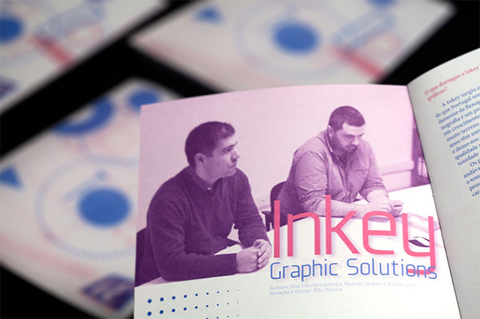
i.E. Magazine No. 5
Created by design students, this magazine layout is a result of creative experimentation in photography, print production, and art using two colors and transparency paper.
[ SOURCE ]
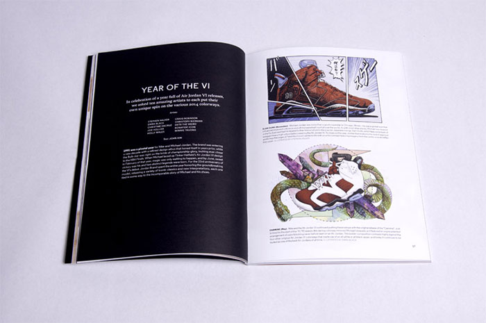
Sneaker News Magazine
This is the inaugural edition of a premium perfect bound magazine about sneakers. Designed by Brooklyn-based artist, the magazine talks about the history of sneakers, the culture, and the personalities of the sneaker world.
[ SOURCE ]
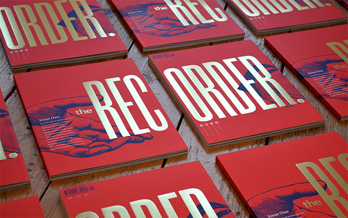
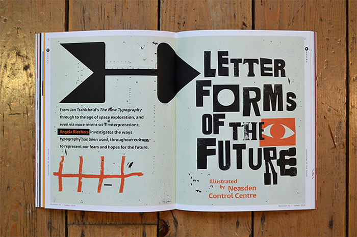
The Recorder Magazine
Here is the magazine layout about fonts. The Recorder, which was relaunched with a whole new look, was first published in 1902. It focuses on the important role that typography and type design play in modern design. The magazine features four sections, namely, Features, Essays, Profiles, and Opinions and showcases a number of bold typographic layouts and illustrations as well as various Monotype fonts.
[ SOURCE ]
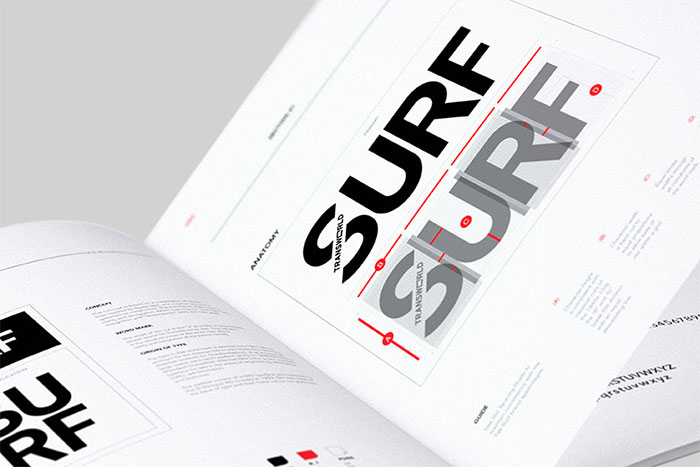
Transworld Surf Redesign
This magazine layout makes use of a photo-driven editorial model, giving the magazine format a new life. The redesign has been intended to create a look of sophistication that does not take itself too seriously.
[ SOURCE ]
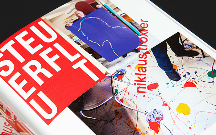
Slanted Magazine
This is the 23rd issue of Swiss magazine Slanted. This issue focuses on Swiss graphic design and features an illustrated section called “Helvetica Illustrated”, a photo series of the former Bond-girl.
[ SOURCE ]
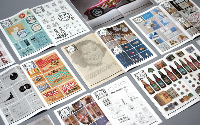
UC Quarterly: Q1-2014
This magazine is published quarterly by Under Consideration blog, featuring a summary of the most interesting, relevant, and simply fun-to-see projects published each quarter across its network of blogs.
[ SOURCE ]
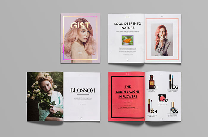
GIST Lifestyle Magazine Layout Design Project
This is an attractive photo-filled layout design for a lifestyle magazine GIST. It features varied subjects from fashion to gadgets, as well as health and tourism. As the name suggests, readers can “get the gist” on all the different topics of each issue.
[ SOURCE ]
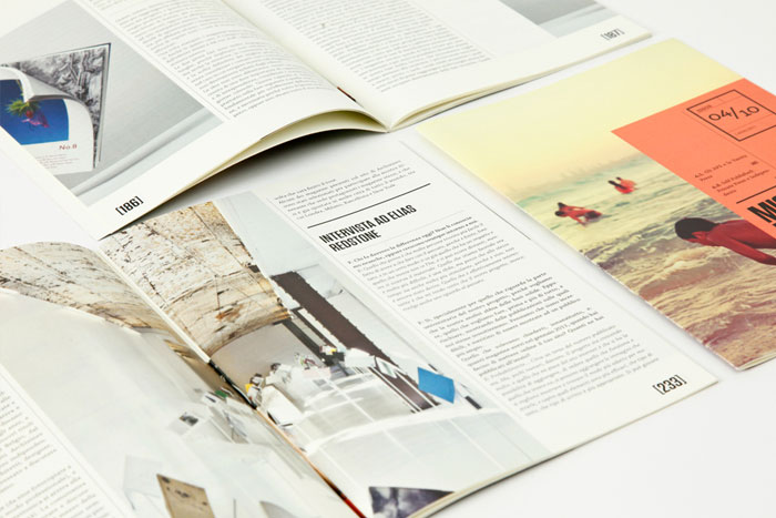
MAG IS IN: A Publication Project
A B5-sized perfect-bound magazine layout for a publication that focuses on independent and self-published magazines from all over the world. The 10 booklets deals feature colorful layout filled with interesting photos and essays on various topics on the history of independent publications.
[ SOURCE ]
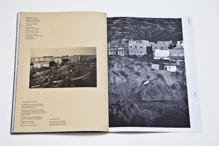
Eldorado Experience One: Surf Morocco
Here is an interesting layout for a travel magazine that focuses on Surfing. Each issue of this annual magazine features beautiful photography and essays about surfing in a particular place. This issue features Surfing in Morocco.
[ SOURCE ]
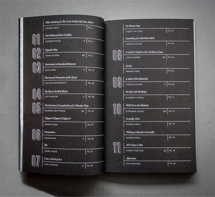
Jeopardy Magazine Layout
A luxurious perfect-bound magazine layout for a publication by Western Washington University. It is an annual publication featuring creative works of the university community. This 48th edition has a timeless look achieved by using historical aesthetic elements paired with modern production methods.
[ SOURCE ]
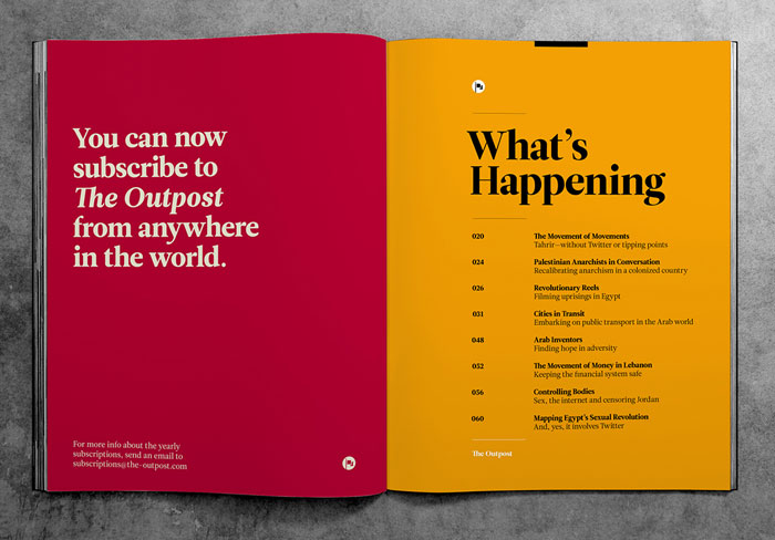
The Outpost Magazine Layout Design
A colorful magazine layout for a publication focusing on the Middle East. It focuses on the conflicts, morals, energies, and opportunities of a changing Middle East and looks into possible future opportunities in the region.
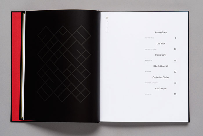
NO3 Oblique Design Magazine
This is the third publication of Oblique, a magazine focusing on art, illustration, design, and architecture.
[ SOURCE ]
Makeshift Magazine
An interesting layout for a quarterly magazine about creativity. The magazine focuses on creativity in unlikely places, from the slums of Rio to the alleys of Delhi. This magazine is about people, the things they make, and the context they make them in.
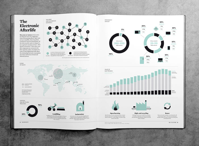
[ SOURCE ]
We Are Neighbors Magazine
A new magazine featuring a particular city in each issue. The magazine aims to be different by staying away from cliches and instead portraying the real spirit and vibe of a city. The first issue features Barcelona and the work of various artists from this place.
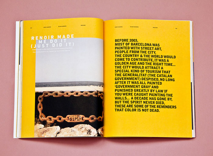
[ SOURCE ]
Beck Magazine Layout Project
A student project featuring a beautiful magazine layout design. It makes use of illustrations and interesting photographs to capture and hold readers’ attention.
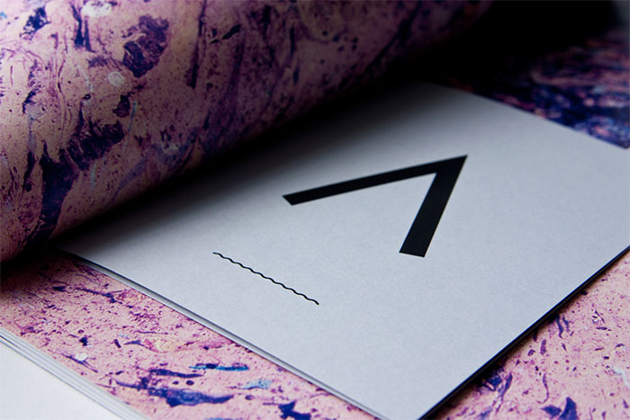
[ SOURCE ]
Jot Down Contemporary Culture Magazine
A black and white Spanish magazine designed and printed for WabiSabi Investments, under the direction of Brands and Roses.
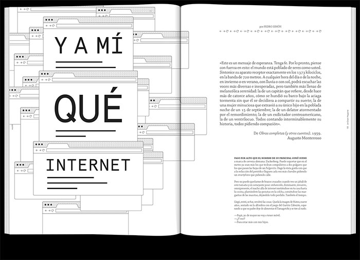
[ SOURCE ]
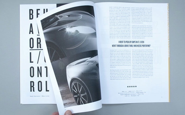
The Idealist Magazine Layout
Targeted to a young and sophisticated audience, this lifestyle magazine features a very attractive cover but minimal inside pages. This layout design approach leaves the definition of “ideal” to the reader’s imagination.
[ SOURCE ]
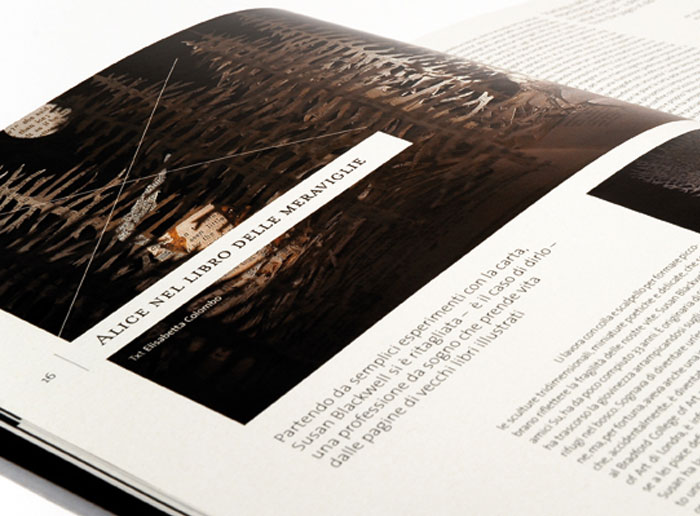
MUST Magazine Layout
Issue no. 18 of MUST magazine has a contemporary look featuring modular outlines with emphasis on asymmetry. It is composed of crisp, clear page layouts in which the blank space is employed in the same way as the “full” sections, giving breathing space to the composition.
[ SOURCE ]

