40 Excellent Examples of Photographer Business Cards
A great photographer needs a great business card. Aside from graphic and web designers, photographers seem to have the most attractive calling cards out there mainly because these are the primary marketing tools that they have to advertise themselves and let the people know about the services that they provide. For inspiration, we are showcasing here a total of 40 photographer business cards from professionals around the world.So to make your calling cards more effective and memorable, make sure to plan the design such as the logo, the information that you want to include, the colors, the paper, and the fonts or types. Be very creative by expressing your own style. A unique design will surely make your cards stand out from the multitude of photographers business cards in the market. Also, the quality of your cards reflects the type of service that you provide as a photographer.
BEAUTIFUL EXAMPLES OF PHOTOGRAPHER BUSINESS CARDS
Most of these photographers business cards are professionally designed and printed using high-quality stock paper. We especially like those letterpress printed business cards on thick paper stock with side paintings. There are also cards that feature bold typographic design while some made use of debossing/embossing and UV coating to make their cards look even better. To know more about each design, such as the designer, the printer, the process used to print the cards, and other important specifications, just click on each preview image of the business card you are interested in viewing. I hope you will find these photographers business cards inspiring as well. Enjoy!
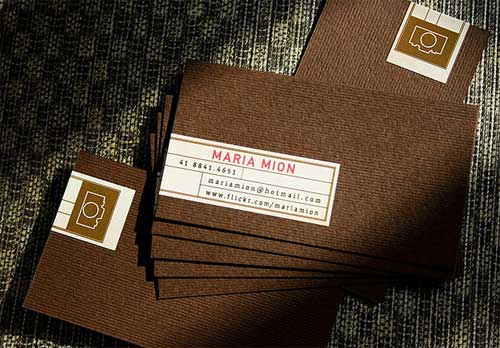
Maria Mion Photographer Business Cards
I love the simplicity of this design. The use of textured stock or paper in dark color makes this card hard to ignore. The simplicity of the logo and the typography used added to the overall look of the card.
[ SOURCE ]
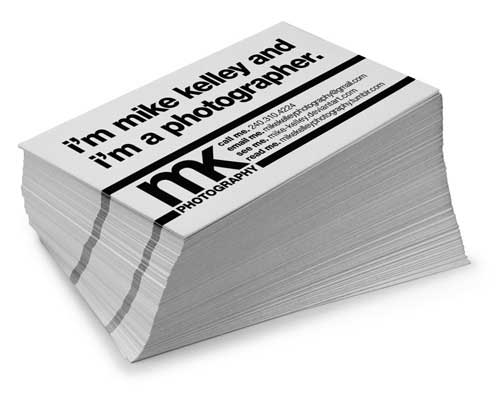
Mike Kelley Photography
Typography is the new black. As shown in this design, the use of bold types combined with a clean white background produces a set of a business card that is hard to overlook.
[ SOURCE ]
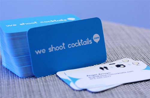
We Shoot Cocktails
A catchy copy combined with colors that are easy on the eyes is a perfect combination for a business card. The rounded corners also make this business card look smooth and friendly.
[ SOURCE ]
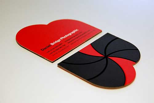
Bridge Photographic – Die Cut with Spot UV Varnish
This card looks very expensive. The die-cut applied resulted in a unique shape perfect for a photographer.
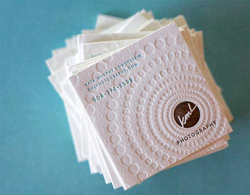
Kate Murphy Lowenstein Photography
I am always bias to letterpress printing. But, having a square card with embossing/de-bossing makes this card look even better.
[ SOURCE ]
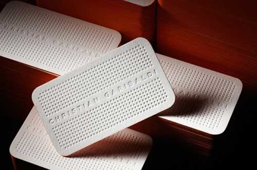
Garibaldi Photography
Another expensive looking business card. Printed on thick cardboard with debossing and side painting. The card looks very clean and professional.
[ SOURCE ]
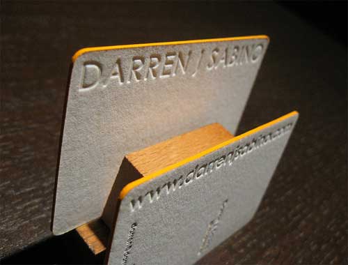
Letterpress Business Card of Darren Sabino
This name card has a very minimalist design. However, the bright yellow side painting and the thick paper used make the cards look irresistible.
[ SOURCE ]
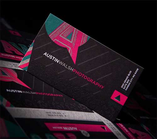
Austin Walsh Photography
Using a dark background for your name card can make it stand out since most business cards, especially the letterpress printed ones are in light or white background. Pink and black go well together.
[ SOURCE ]
Amon Focus Photography Business Card
Using your best photographs as a background for your business card gives people a peek on how good a photographer you are.
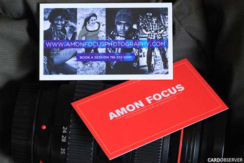
[ SOURCE ]
Kinetic Lens
This card is letterpress printed using spot colors with debossing to create texture on the card.
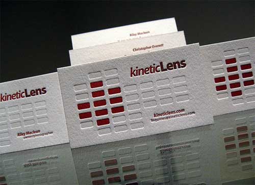
[ SOURCE ]
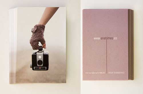
Ana Himes Personal Business Card
An interesting photo on the face of the card such as the one used here can also make your photographer business card memorable.
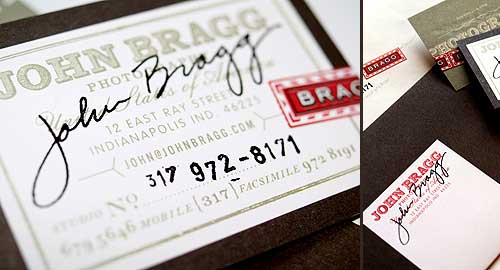
John Bragg Photography
How about personalizing your business cards by putting your own signature on it?
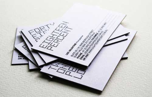
Eighteen Percent Photography
A simple design using a modern type can make your card look professional.
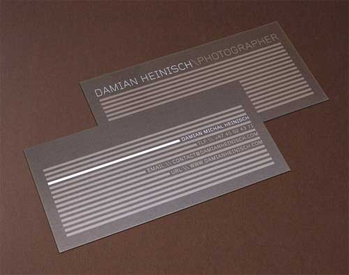
Damian Heinisch/ Photographer
A dark background with a clean design such as the one below looks very professional and outstanding.
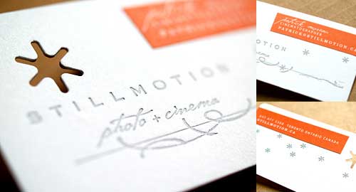
Still Motion: Photo + Cinema
The logo in this card was die cut for a bigger impact. The use of bright color such as orange against a plain white background also complimented the entire look of the card.
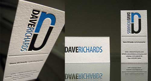
Dave Richards/ Photographer
Another letterpress printed card using thick paper and a nice blue-black color combination.
[ SOURCE ]
Business Card for Photographer
Putting a QR code on your card that automatically directs to your online portfolio is a good way to let people know about your work.
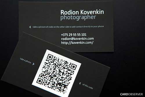
[ SOURCE ]
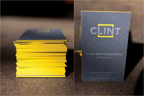
Clint Shuttlesworth
The yellow side paintings on a letterpress printed business card with the black background look very nice.
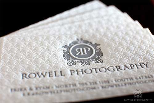
Rowell Photography
Again, this card looks very expensive and people would surely keep them.
[ SOURCE ]
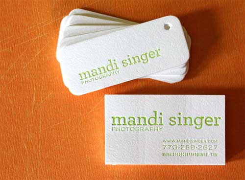
Mandi Singer Photography
Mini business cards with simple text are also good options for photographers. The mini cards below are letterpress printed.
[ SOURCE ]
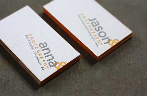
Ana & Jason Photography
Simple yet very eye catchy business cards for photographers. Changing the perspective can make your cards unique.
[ SOURCE ]
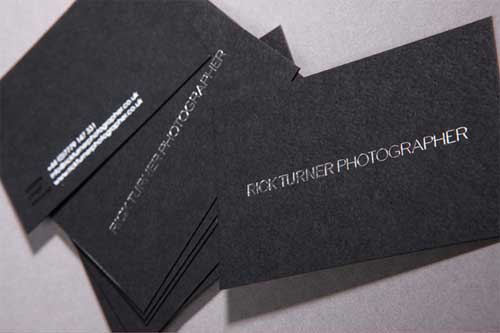
Rick Turner, Photographer
Simple letterpress printed cards with silver foiling.
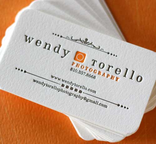
Wendy Torello Photography
[ SOURCE ]
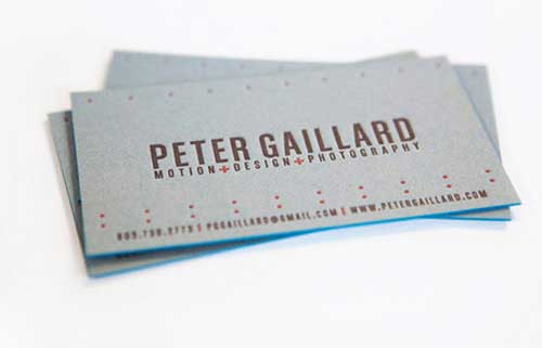
Peter Gaillard’s Grey Business Card
[ SOURCE ]
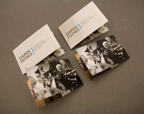
Darek Fedko Business Card
A folded business card with four sides featuring sample work from the photographer. Having a folded card gives you lots of space to exhibit your work as a photographer.
[ SOURCE ]
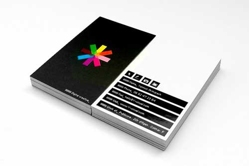
Yannick Photography
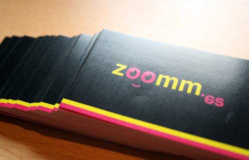
Zoom.es Business Cards
Use of dark background and text in bright colors can have a big impact on name cards.
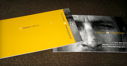
David Clifford Photography
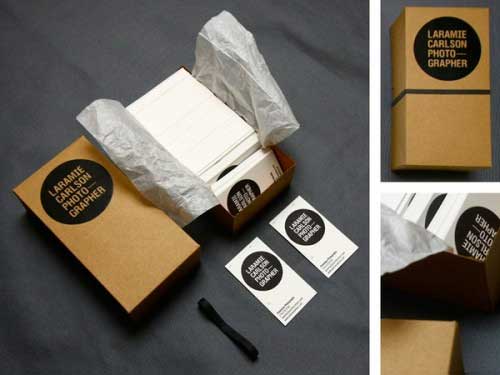
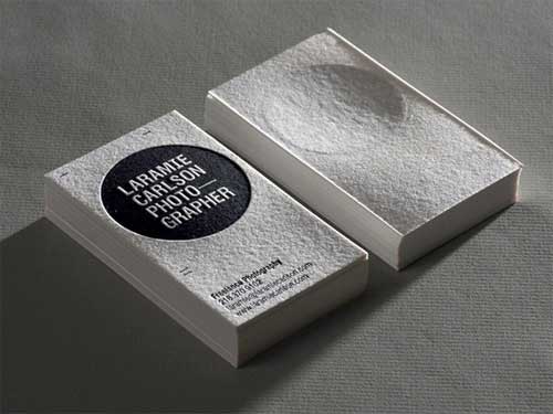
Laramie Carlson/Photographer
[ SOURCE ]
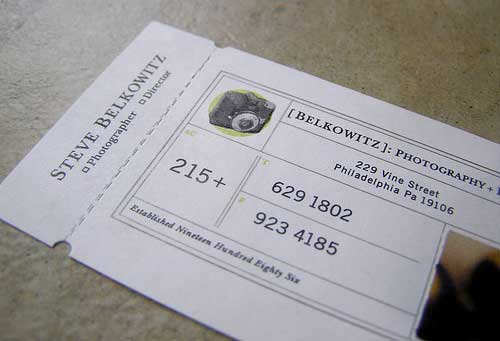
Steve Belkowitz Ticket Business Card
[ SOURCE ]
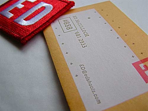
Ed McCulloch Photography
[ SOURCE ]
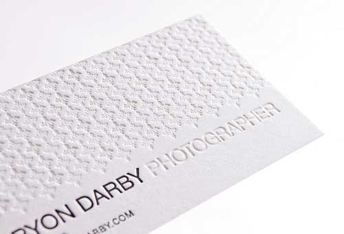
Bryon Darby Clean Letterpress Business Card
[ SOURCE ]
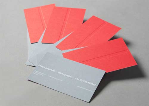
Philip Ljungström Card with Red Sleeve
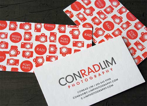
Conrad Lim Photography
[ SOURCE ]
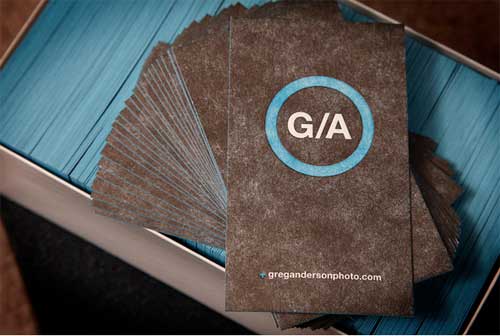
Greg Anderson Photography
[ SOURCE ]
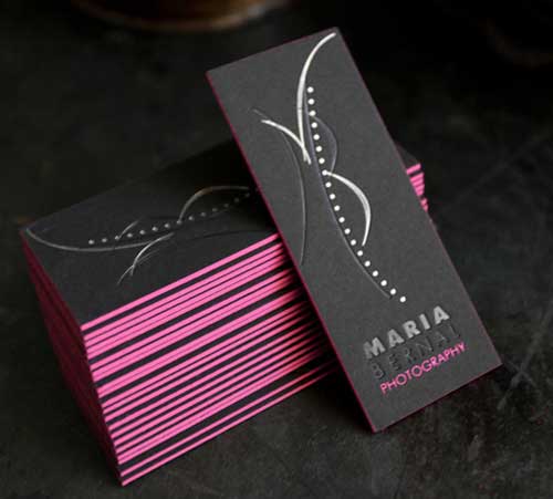
Maria Bernal’s Sexy Mini Thick Business Cards
These cards have hot pink side paint.
[ SOURCE ]
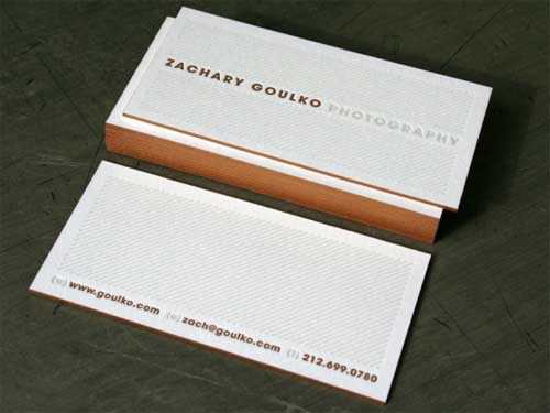
Zachary Goulko: Photographer Business Cards with Flashy Edge
[ SOURCE ]
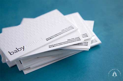
Maylin Brito Minimalist Cards
[ SOURCE ]
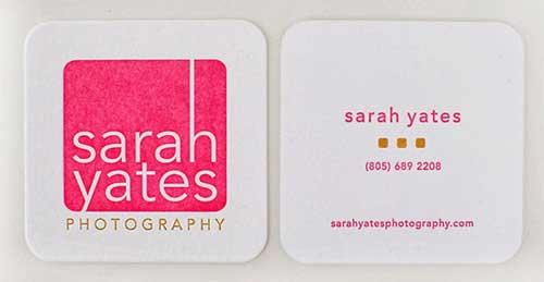
Sarah Yates Square Cards in White and Pink
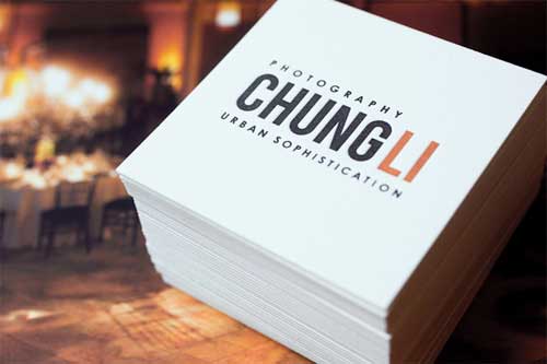
Chung Li Photography Square Cards
[ SOURCE ]


