30 Excellent Table of Contents Design Examples
Next to cover design, the next thing that a person sees whenever he or she reads a book or a magazine is the table of contents (TOC) design. As a designer, one, therefore, needs to realize the importance of making the table of contents design as interesting as the cover page.
In the past, table of contents design is one of the most neglected parts of a book cover, annual report designs or magazine layout simply because this page only contains the main parts of the publication and their respective locations. However, recently, we have been seeing a trend towards making the table of contents design visually appealing. Now, we see graphic elements, photos, and creative typographic designs in the TOC.
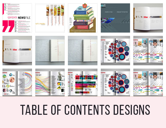
30 EXAMPLES OF TABLE OF CONTENTS DESIGN
In case you are looking for some inspiration in creating visually rich TOC, we have compiled here a total of 30 mouth-watering tables of contents designs for you to check out. To know more about each design, simply click on the link below each preview image.
Magazine Table of Contents
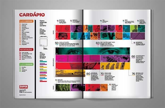
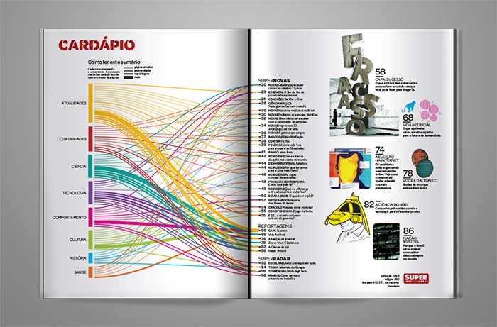
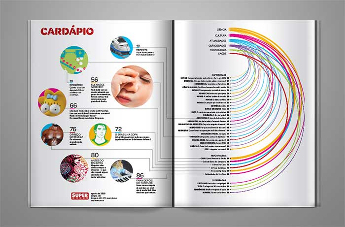
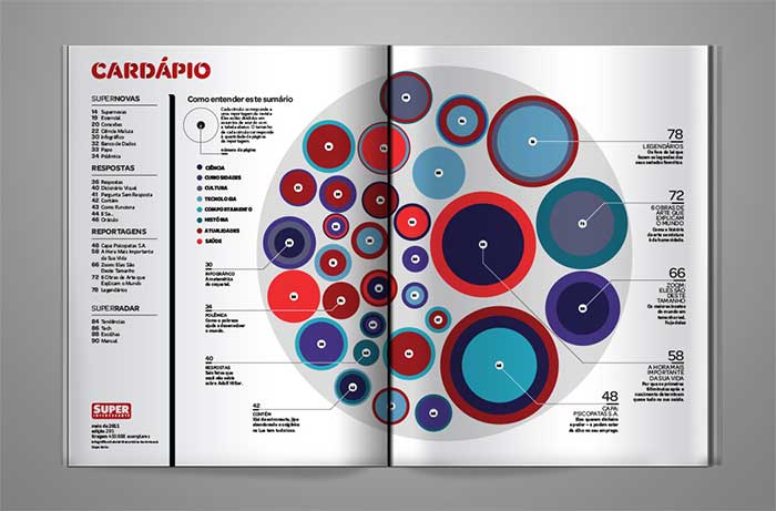
These are some pages from the table of contents design of Superinteressante Magazine. The spreads are designed to display the magazine’s content, including pages, pictures, texts, and subjects, as data visualization. Every issue features a different graphics solution. We are featuring only two examples below. Follow the link to see some additional awesome table of contents design examples.
[ SOURCE ]
Annual Report Table of Contents
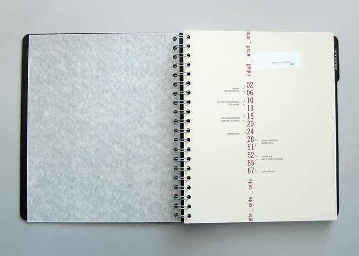
Here is a clean and minimal vertical table of contents design of an annual report.
[ SOURCE ]
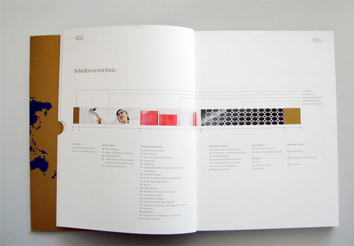
Morphosys 2007 Annual Report
[ SOURCE ]
Magazine Spread: Table of Contents
The table of contents design for Connect Magazine. The layout makes use of diagonal lines and modern font types.

[ SOURCE ]
Unique Table of Contents
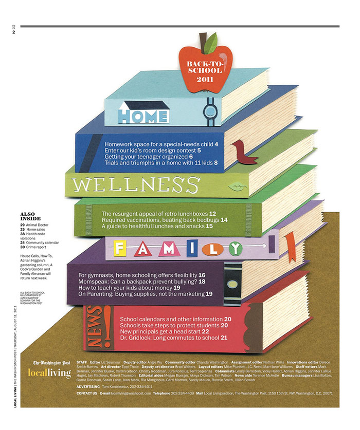
For this table of contents of The Washington Post’s Local Living, a stack of books was used to make it unique.
[ SOURCE ]
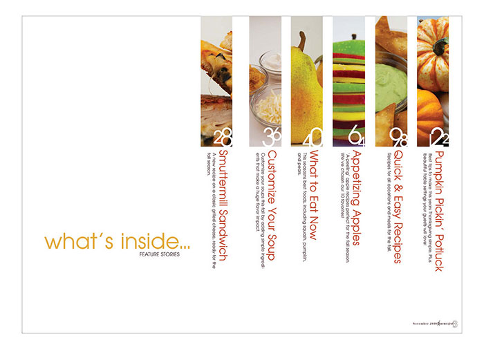
Vertical Table of Contents
A very clean and neat concept for a table of contents design using a vertical and horizontal arrangement of elements. The key to achieving this look is to use nice photos.
[ SOURCE ]
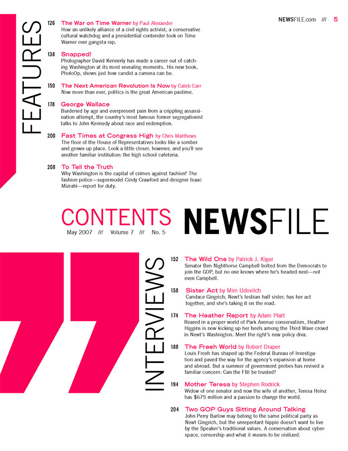
Table of Contents for Magazine
The designer was able to break the monotony in this rather boring text-filled table of contents design by mixing in huge types and the use of contrasting pink and black color scheme. This kind of layout is useful if you are short for space and you have a lot of stuff to include in the TOC.
[ SOURCE ]
Eye Magazine Table of Contents Design
Two options for the redesign of Eye magazine’s table of contents page. The first photo is the actual table of contents while the second at the bottom is the experimental version.

[ SOURCE ]
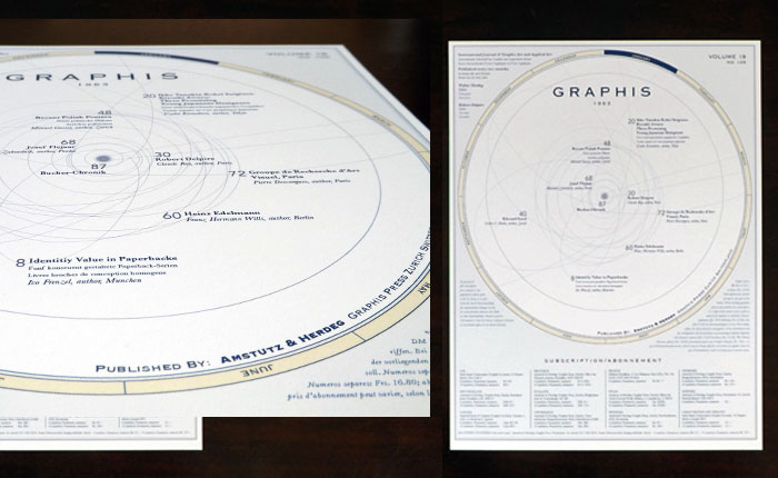
Graphis Table of Contents Design
Table of contents design for Graphis Magazine. The idea of incorporating a map of the solar system grew out of the desire to communicate all that the international magazine encompasses.
[ SOURCE ]
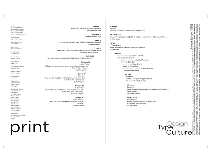
Magazine Spread: Table of Contents
This table of contents design sports a very elegant look through the use of only fonts and placement of texts.
[ SOURCE ]
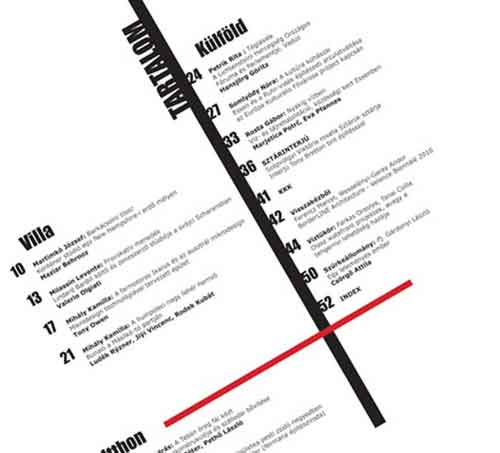
Sample Table of Contents Design
Using diagonal lines can create a unique interest in a rather bland and simple design as shown in the example below.
[ SOURCE ]
TOC of Stark Magazine
Another simple table of contents layout for a magazine. One can add interest to a boring design by putting interesting photos.

[ SOURCE ]
Table of Contents for Clothing Magazine
A colorful design for a magazine’s table of contents. The use of big types or fonts mixed with interesting photographs makes this design eye-catching.

[ SOURCE ]
Table of Contents: Extra Ordinary
A photo-based table of contents. This is ideal to use if you want to have plenty of breathing space in your design.

[ SOURCE ]
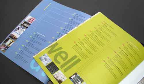
Dwell Magazine’s Table of Contents
Dwell uses a unique color palette for each issue. Usually, the table of contents introduces the issue through a colorful layout, making it an attention-grabbing page amidst the ads at the front of the magazine.
[ SOURCE ]
Spread Magazine Table of Contents
An illustrated table of contents design for a Design magazine.

[ SOURCE ]
The Verve Table of Contents
A very creative table of contents page design layout inspired by the jellyfish.

[ SOURCE ]
Car Magazine Table of Contents
This was designed using a car’s speedometer for the page numbers.

[ SOURCE ]
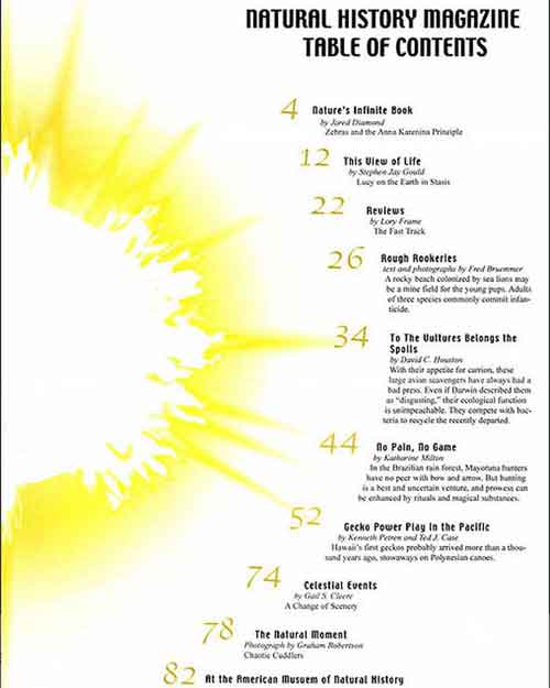
Science Magazine Table of Contents
A concept layout for a table of contents for a Science Magazine.
[ SOURCE ]
Shred Table of Contents
If you are working on a table of contents that’s spread in two-pages, then you can take some inspiration from this. The key to achieving this look is to use an interesting photograph and nice typography. A dark background is also a must.

[ SOURCE ]
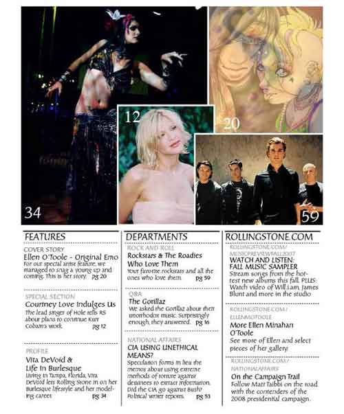
Sample Table of Contents for Magazine Layout
This kind of layout for a table of contents is common among popular magazines. When using this kind of layout, make sure to use interesting photographs.
[ SOURCE ]
Simple Table of Contents
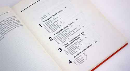
Good design will never become obsolete. Here is a traditional, simple and clean table of contents for a Statistics book published in 1969.
[ SOURCE ]
Sports Magazine TOC

[ SOURCE ]
Magazine Spread: Table of Contents
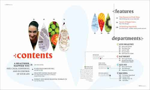
Created for Self magazine, the teardrop shapes in the table of contents page were adapted from the magazine’s cover, which makes use of that shape in its masthead.
[ SOURCE ]
Creative Table of Contents
Here is another creative table of contents design for a magazine using colorful artwork and graphs.

[ SOURCE ]
Table of Contents for Mock Magazine
This layout makes use of bold texts and colors.

[ SOURCE ]
CMYK Magazine: Table of Contents
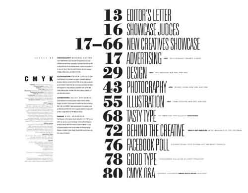
Typographic design for a table of contents. This look can be best achieved by combining fonts intuitively.
[ SOURCE ]
Typographic Table of Contents Design
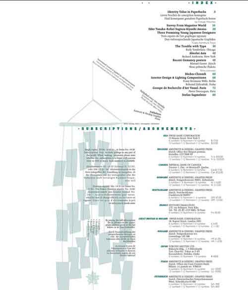
Here is another text-filled layout for a table of contents design. This would be perfect for a text-heavy book or a magazine layout.
[ SOURCE ]
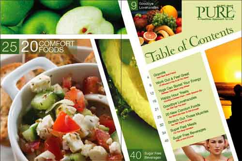
Pure – Table of Contents
Pure Magazine Table of Contents editorial layout.
[ SOURCE ]
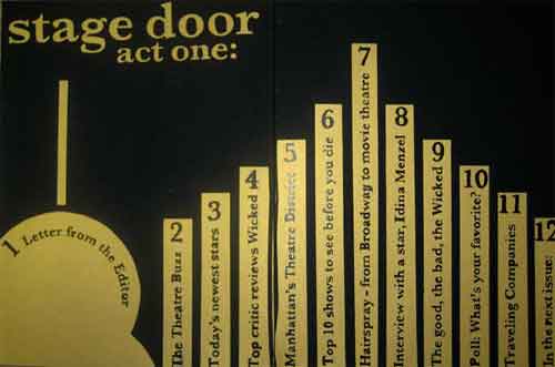
Stage Door Table of Contents
All of the lettering in this table of contents design (except the line that reads, “stage door act one” were handwritten using pen and ink.
[ SOURCE ]


